Style Guide Test Page
What follows is a style guide and pattern library, showing many allowed elements for EPA.gov. You should also:
Table of Contents
Boxes
- About Boxes
- Related Info
- Highlight
- News
- Alert
- Simple
- Multipurpose
- Special one item
- No Style
- RSS
- Blog
- Quiz
- Clearing Box (and image) Floats
Colors
Columns
Disclaimers
Forms
Images and Graphics
JavaScript Snippets
Lists
- Unordered list
- Ordered list
- Roomy list
- Definition list
- Unordered list, pipeline
- Unordered list, tabs
- On This Page/ Table of Contents
Microsites
Tables
- Table, default
- Table, no borders
- Table, no stripes
- Table, no style
- Accessible tables
- Datatables (sortable tables)
Text
- Emphasis (italics)
- Strong (bold)
- Small
- Mark
- Warning
- Abbreviation
- Code
- Super/ Subscripts
- Blockquote
- Pull Quote
- Indented text
- Headings
- Highlighted Heading
- Separators (horizontal rules)
- Top of Page links
- Adding Definitions to your page
Widgets, iFrames, and Stuff Under Development
Boxes
Boxes are used to highlight specific web content. Each box style has specific content requirements and should be used appropriately.
Related link:
Related Info Box
Boxes that contain text lists of Related Information / More Information / Related Topics (will not necessarily have any of these phrases in the title). Related information is not critical or featured content.
- Green header and border
- This is the only box available in basic pages using the Drupal WebCMS editor. When used on a basic page, it can be floated left or right. It is also available in Panelizer.
How to:
- In Panelizer, add content, then select Related Info from the Box Style dropdown menu.
- In the Drupal WebCMS editor, click the Related Info Box button.
Highlight Box
Used to contain one set of related, critical, featured content — a new regulation or publication, Did you know? , data and statistics, Fast facts, top tasks / questions / How do I?
- Bright orange header and border, to attract attention.
How to:
- In Panelizer, add content, then select Highlight Box from the Box Style dropdown menu.
- Replacing the multipurpose box with a highlight box in the WYSIWYG.
Hot Tips For A Cool Summer!
We’ve got tips and apps to help you save money, cut energy costs, and continue to protect your health while still enjoying the summer.
- Read the tips
- Get local info from MyEnvironment
News Box
A box for lists of events, such as recent press releases or upcoming calendar events.
- Dark blue header and border
How to:
- In Panelizer, add content, then select News Box from the Box Style dropdown menu.
- Replacing the multipurpose box with a news box in the WYSIWYG.
EPA Climate News
(6/26/2012) U.S. Court of Appeals- D.C. Circuit Court Upholds EPA’s Actions to Reduce Greenhouse Gases under the Clean Air Act
(4/16/2012) EPA Publishes National U.S. Greenhouse Gas Inventory
(3/27/2012) EPA Proposes First Carbon Pollution Standard for Future Power Plants/Achievable standard is in line with investments already being made and will inform the building of new plants moving forward
More Headlines > (NOT A WORKING LINK)
Alert Box
The alert box is reserved for very important messages.
- Red header and border
- Not just for emergencies, but can also be used for high priority, short deadline announcements such as new software releases for site users, notices for review, or expiring comment periods.
- To comply with Section 508 requirements, text headings for all alert boxes should also indicate the alert status, i.e. “Emergency Alert: Pesticide Safety Notice”.
- In general, this should not be considered a permanent element on a page. An exception would be things like the number to call for chemical spills.
Alert box title examples:
- Less accessible: Hurricanes expected!
- More accessible: Emergency alert: Hurricanes expected!
- Less accessible: Air Quality Info
- More accessible: Air Quality Alert
How to:
- In Panelizer, add content, then select Alert Box from the Box Style dropdown menu.
- Replacing the multipurpose box with an alert box in the WYSIWYG.
UV Alert
It’s critical to know the level of ultraviolet (UV) radiation before you plan outdoor activities. The UV Alert system issues a notification when the level of solar UV radiation is predicted to be unusually high, and consequently the risk of overexposure is greater. The UV Alert provides SunWise action steps that you should take to reduce risk of overexposure.
We encourage you to check the UV Index daily or to sign up using our free EnviroFlash service to receive the UV Alert by email.
Be SunWise: Sign up for UV Alerts!
Simple Box
For when you want to have an image as the header, or for boxes without colored headings. Also used to create quizzes.
- Gray border, no heading
How to:
- In Panelizer, add content, then select Simple Box from the Box Style dropdown menu.
- To create a Simple Box with image header:
- Leave the title field blank.
- In the body field, click Add Files and Images to upload or select an image.
- Under Options, select the Box Header format. Do not align image or add a caption. Click submit.
- In the body field, under the image, add content as needed.
- Replacing the multipurpose box with a simple box in the WYSIWYG.
Simple box differs by having an outline only—no colored header. You can have as much text as you need
- Can have lists
- With as many list items as needed
- And embedded images:

Simple box with image header. Image set to "box header" format.
You can have as much text as you need
- Can have lists
- With as many list items as needed
- List item 3
Multipurpose Box
This is for all other content that needs to be boxed, that does not meet other box styles content requirements.
- Dark gray header and border
How to:
- In Panelizer, add content, then select Multipurpose Box from the Box Style dropdown menu.
- Replacing the multipurpose box with a gray box in the WYSIWYG.
Project Facts
Total = $2,240,000
EPA = $1,200,000
Match/leverage = $1,040,000
Schedule: February 2010 to December 2012
Recipient: San Francisco Planning Department
Partners: San Francisco Public Utilities Commission, Friends of the Urban Forest, Plant SF, CC Puede.
Special One Item Box
Boxes used to feature one special item, such as one link to one page (unlike the Highlight Box, which can have a related set of featured content items).
- Light gray box, no border
How to:
- In Panelizer, add content, then select Special One Item Box from the Box Style dropdown menu.
- Replacing the multipurpose box with a special item box in the WYSIWYG.
Air Pollution
The Clean Air Act requires EPA to set National Ambient Air Quality Standards for six common air pollutants. These air pollutants are found all over the United States.
No Style Box
Used on microsite homepages, can feature image headers. The associated padding creates columns without adding visible lines.
- No color, no border
How to:
- In Panelizer, add content, then select No Style Box from the Box Style dropdown menu.
- To create a No Style Box with image header:
- Leave the title field blank.
- In the body field, click Add Files and Images to upload or select an image.
- Under Options, select the Box Header format. Do not align image or add a caption. Click submit.
- In the body field, under the image, add content as needed.
No Style Box
This is used on Microsite homepages. You can have as much text as you need.
- Unordered lists, too
- With as many list items as necessary
- And embedded images
RSS Feed Box - Limited to Webmasters
Used to display RSS feeds of 3-5 blog or news release entries.
- Royal blue header and border, heavy bottom border
- Incorporates RSS logo and link to EPA newsroom.
If 3rd party content is used, you are responsible for that content. Dynamic lists can pull in www.epa.gov content without the need for any JavaScript.
How to:
- In Panelizer, add content, then select RSS Feed Box from the Box Style dropdown menu.
- This content is important, as it provides a fallback if JavaScript is disabled.
- Webmasters must add code and JavaScript. See: Javascript: RSS Feed.
- Replacing the multipurpose box with a RSS feed box in the WYSIWYG.
Region 1 News Releases
Complete RSS feed for EPA Region 1: New England.
Twitter Box - Limited to Webmasters
Used primarily on microsite homepages, to display official EPA Twitter accounts tweets or tweets related to a specific hashtag. Due to Twitter's API restrictions, we use Twitter embeddable timelines. Contact your Web Council representative to find out how to embed a Twitter feed into your home page.
An embedded feed of an official EPA Twitter account will show all tweets sent by EPA but should not show replies or retweets. An embedded feed based on a specific EPA hashtag is possible but should first be reviewed and approved by the Office of Web Communications in OPA. A hashtag feed requires additional set-up within a Twitter account, and then regular monitoring for content.
See the Twitter how-to page for an example of an embedded Twitter timeline.
How to:
- In Panelizer, add content, then select No Style Box from the Box Style dropdown menu.
- Don't use the Twitter box: it will add duplicate code and imagery.
- Webmasters must add appropriate Twitter code and JavaScript.
Blog Box - Limited to Webmasters
Used primarily on microsite homepages. Displays one blog entry with teaser text and link to content.
- Light green header and border, heavy bottom border
- Incorporates Greenversations logo and link to EPA blog
How to:
- In Panelizer, add content, then select Blog Box from the Box Style dropdown menu.
- Manually add blog title links, authors, and teaser information to the body field.
- You'll have to continuously update this content.
- Note that the example, to the right, is from 2012!
- Replacing the multipurpose box with a blog box in the WYSIWYG.
It’s Our Environment
- National Lead Poisoning Prevention Week: Keeping our Kids Healthy Starts at Home
By Jess Portmess My new nephew is still too young to pick up toys or explore the floors and walls of the house on all fours. But if his daily growth is any indication, it’s not that far off. I didn’t imagine my clerkship with EPA could make me…
Quiz Box - Limited to Webmasters
Created using the Simple Box and form elements.
- Gray border
How to:
- In Panelizer, add content, then select Simple Box from the Box Style dropdown menu.
- To create a Simple Box with image header:
- Leave the title field blank.
- In the body field, click Add Files and Images to upload or select an image.
- Under Options, select the Box Header format. Do not align image or add a caption. Click submit.
- In the body field, under the image, add content as needed.
- Webmasters must add the form elements directly to the code.
- Quiz Box Example. Panelizer is required.
- Replacing the multipurpose box with a quiz box in the WYSIWYG.
- The directions for panelizer still apply.
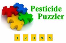
C is the correct answer.
Products containing bleach that claim to "sanitize" or "disinfect" are considered pesticides and must be registered with EPA. However, products containing bleach that do not claim to sanitize or disinfect are not pesticides and are often sold as laundry additives or cleaners. All liquid bleach products are hazardous to skin and eyes and may harm you if not used according to label directions. Always read the label first before using any product.
Hey... No Peeking!
You need to select an answer to the question before we'll show you the right answer...
Clearing Floats
When adding boxes and images that are floated to the left or right, you can add content that “clears” these floated elements by adding one of the following classes:
clear-leftclear-rightclear-both
Example:
Lorem ipsum dolor sit amet, consectetur adipiscing elit. Ut imperdiet aliquet sollicitudin. In lectus metus, rhoncus ut volutpat vel, aliquam nec mauris. Donec vestibulum consequat metus, a eleifend dui porttitor at. Nam cursus porttitor cursus. Cras vulputate adipiscing tortor, sed rutrum velit scelerisque non. Etiam iaculis accumsan sodales. Donec dolor eros, consectetur id aliquet quis, imperdiet sed lorem. In eget libero in ante molestie ullamcorper ut nec diam. Cras semper blandit est, id cursus magna porttitor quis. Vivamus quis dui eu purus ullamcorper adipiscing. Suspendisse rhoncus condimentum bibendum. Suspendisse vulputate neque quis tortor ornare elementum. Integer fringilla consectetur nunc, a mollis risus adipiscing vitae. Nulla varius egestas bibendum. Maecenas orci ipsum, feugiat nec posuere eu, facilisis malesuada mi.
Duis ut ante est. Suspendisse id tortor augue. Ut mauris dolor, elementum sed faucibus vitae, malesuada nec libero. Sed sed ipsum urna. Duis sed turpis ipsum, vel accumsan eros. Morbi in dolor quam, quis interdum felis. Aliquam commodo leo quis orci mattis eleifend. Lorem ipsum dolor sit amet, consectetur adipiscing elit. Nunc ac leo ac lectus fermentum lobortis. Phasellus dapibus quam id sem congue non aliquet nulla volutpat. Ut ullamcorper nulla nibh. Proin dapibus scelerisque nulla. Nunc pulvinar, odio in malesuada condimentum, libero justo consectetur odio, a volutpat risus orci nec augue. Nam eget tempor dolor. Aliquam in varius elit
How to:
- First, add your content. Then add your floated images (or boxes, etc.).
- Disable rich-text and add the appropriate clear to the end of the
<div>class.- Match your clear to your float. If you float right, then clear right.
- Image code example:
<div class="figure image mode-media_large caption right clear-right"> - Box code example:
<div class="box multi related-info clear-left">
Color Palette
This palette’s primary colors are blue, gray, and white. Blue is commonly associated with trust, confidence, and sincerity; it is also used to represent calmness and responsibility.
- Aqua #02bfe7, Darkest Aqua #046b99, Dark Aqua #00a6d2, Light Aqua #9bdaf1, Lightest Aqua #e1f3f8
- Base #212121
- Blue #0071bc, Darkest Blue #112e51, Dark Blue #205493
- Gold #fdb81e, Light Gold #f9c642, Lighter Gold #fad980
- Gray #5b616b, Dark Gray #323a45, Light Gray #aeb0b5, Lighter Gray #d6d7d9, Lightest Gray #f1f1f1
- Green #2e8540, Light Green #4aa564, Lighter Green #94bfa2, Lightest Green #e7f4e4
- Red #e31c3d, Darkest Red #981b1e
- White #fff, Dark Warm Gray #494440, Light Warm Gray #e4e2e0
For more on these colors, please see: U.S. Web Design Standards color page.
Columns
Using the Panelizer layouts and boxes to create columns is easier for users who prefer not to work in code. However, columns can also be created by manually adding the same code from the image gallery style.
There are two components to the grid system: rows and columns. Rows are horizontal and can contain up to five columns. Columns are vertical and are placed inside rows. Rows can also be placed inside columns to create nested layouts, but currently only the first level of columns is responsive.
Column widths can be set in two ways. For equal-width columns, you can specify the number of columns inside a row using the cols-x class, where x is the number of columns (1-5).
Here's the markup for creating three equal-width columns:
<div class="row cols-3">
 <div class="col">Column 1</div>
 <div class="col">Column 2</div>
 <div class="col">Column 3</div>
</div>
You can also specify the width of a column by using the size-xofy class, where x/y is the ratio of column width to row width. Here's the markup for creating three columns of different widths:
<div class="row cols-3">
 <div class="col size-1of4">Column 1 - 25% wide</div>
 <div class="col size-1of2">Column 2 - 50% wide</div>
 <div class="col size-1of4">Column 3 - 25% wide</div>
</div>
Disclaimers
Exit EPA
Use only for links to external non-federal government sites. Follow the External Site Links procedure.
For lists of external links or pages with multiple exiting links, use the multiple exiting links disclaimer.
Examples
Multiple exiting links disclaimer: The following links exit the site Exit
How to:
- First, add content to the page.
- Add the disclaimer using the Drupal WebCMS editor exit button.
- For the multiple exiting disclaimer:
- Before the list of external links, add the disclaimer using the Drupal WebCMS editor multiple exit button.
Related links:
EPA Intranet
Use only for links to internal EPA sites.
Examples
Multiple exiting links disclaimer: The following links are internal Intranet
How to:
- First, add content to the page.
- Add the disclaimer using the Drupal WebCMS editor exit button.
- Modify the word "Exit" to "Intranet" and change the link to
/web-policies-and-procedures/intranet-disclaimer - For the multiple exiting disclaimer:
- Before the list of external links, add the disclaimer using the Drupal WebCMS editor multiple exit button.
File Info
Provides file information for PDF and other non-HTML files, letting users known the size and type of file.
Examples:
This is the document title (PDF) (xx pp, yy K, About PDF)
This is the document title (DOC) (xx pp, yy K)
How to:
- Add the disclaimer using the Drupal WebCMS editor file info button.
- For files other than PDF, delete the “About PDF” link (e.g., Word or Excel documents).
- Write over the default information to include the specific number of pages and file size.
- You may need to disable rich-text and manually add the
<span class="fileinfo">tags.<span class="fileinfo">(xx pp, yy K, <a href="/home/pdf-files">About PDF</a>)</span>
Related Links:
New! Icon
Use “NEW!” when you would like to draw attention to new content on the page.
- Use anywhere on any page.
- Too many, of course, dilutes the message/impact.
- The New Icon automatically disappears after 30 days.
Example:
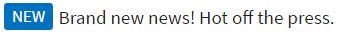
- First, add the content to page.
- Highlight the new content.
- Select the Drupal WebCMS editor new icon button.
Related links:
PDF Disclaimer
Follow the Web Standard for PDF Links.
- Use the standard disclaimer for a page that contains multiple PDFs, right before the list of PDFs or immediately before the first reference to a PDF.
- When the long version is problematic, or where you have only a few PDFs linked, you may use the inline disclaimer, which links to EPA's “About PDF” page. Only required once per page.
Example:
You may need a PDF reader to view some of the files on this page. See EPA’s PDF page to learn more.
Inline Disclaimer: This is the document title (PDF) (22 pp, 245 K, About PDF)
How to:
- For the standard disclaimer, apply by selecting the Drupal WebCMS editor PDF disclaimer button.
- For the inline disclaimer, apply by selecting the Drupal WebCMS editor file info button.
- Use the Inline disclaimer in panels or boxes.
Related links:
- Web Standard: PDF Links (linking to PDF Files)
- Web Standard: PDF: When to Use, Document Metadata, Info Required for PDF Sections
Special File Formats
Use to direct users to a page detailing free viewers for files in the following formats: Microsoft Excel, PowerPoint, Publisher & Word, KML, Flash, Quicktime, Windows Media, zip.
Example:
How to:
Select the EPA Free Viewers button from the Drupal WebCMS editor.
Search EPA Archives
Use for links to EPA Web Archives home page.
Example:
How to:
Select the EPA Archive Link button from the Drupal WebCMS editor.
Related Link:
Forms
Forms are used for things like submitting questions or comments, registration, or requesting services. In Drupal WebCMS, forms are created using the Webforms content type. Follow the Forms Web Standard.
How to:
- From the web area home page, click Create Content.
- Select the Webforms content type and add required content and metadata to the page. Click Save.
- After creating the form page, select the Webforms tab to add form components (see below for various form components and styles).
- Improve the accessibility of your forms by using default values in components, accurate names and labels, and clear descriptions.
Related links:
Select list
Creates a dropdown list of options.
Example:
How to:
- First, create a Webform.
- Under the Webform tab, enter a name for the new component and pick Select Options from the Type dropdown. Click Add.
- In the Edit Component screen, enter information as needed.
- Under Display, click Listbox to create the dropdown menu. Click save.
Radio options
For when users need to select only one option from a list.
Example:
How to:
- First, create a Webform.
- Under the Webform tab, enter a name for the new component and pick Select Options from the Type dropdown. Click Add.
- In the Edit Component screen, enter information as needed. Radio list is the default setting for this type of component, do not select Multiple or Listbox as this creates checkboxes and select lists. Click save.
Checkboxes
Can be used to allow users to select multiple options from a list.
Example:
How to:
- First, create a Webform.
- Under the Webform tab, enter a name for the new component and pick Select Options from the Type dropdown. Click Add.
- In the Edit Component screen, enter information as needed. Select Multiple above the Options field to create checkboxes. Click save.
Textfield
One line areas that allow user to input text. For multiple lines, use a textarea.
Example:
How to:
- First, create a Webform.
- Under the Webform tab, enter a name for the new component and pick Textfield from the Type dropdown. Click Add.
- In the Edit Component screen, enter information as needed. Click Save.
Textarea
Text field that spans multiple lines.
Example:
How to:
- First, create a Webform.
- Under the Webform tab, enter a name for the new component and pick Textarea from the Type dropdown. Click Add.
- In the Edit Component screen, enter information as needed.
Report a Violation Badge
The "Report a Violation" badge and link are required on the web area contact us form.
Example:
Please see the example to the right.
How to:
When a new web area is created, the badge is automatically part of the web area contact us form. For contact us forms that do not have the badge, copy the HTML below.
<div class="box right">
  <div class="slat-image">
    <a href="/tips"><img alt="Report an environmental violation" src="/sites/all/themes/epa/img/badge.gif" /></a>
  </div>
  <div class="slat-content">
    <div><strong><a href="/tips">Report a Violation</strong></div>
    <p><small>Report possible violations of environmental laws and regulations.</small></p>
  </div>
</div>
- In the code view, place the code before the mailing address.
Buttons
The example for the submit button applies to all buttons.
- Blue background, on rollover darker blue.
- White text.
Example:
How to:
- Buttons are automatically added to the bottom of Webforms pages.
Lists
Unordered list
Unordered lists are bullet lists. Use unordered lists normally. In the main content areas for Microsite homepages, the bullets are styled differently.
Example:
- magna
- cras
- gravida
- pluribus
- etna
- aliquam
- lorem
- egestas
How to:
- First, add your content.
- Select or highlight text.
- Click the Drupal WebCMS editor Insert/Remove Bulleted List button.
- To nest a list item, highlight the list item and click the Increase Indent button.
Ordered list
Ordered lists are numbered lists. Use ordered lists normally.
Example:
- velit
- eu
- gravida
- pluribus
- etna
- aliquam
- elit
- sit
- G
How To:
- First, add your content.
- Select or highlight text.
- Click the Drupal WebCMS editor Insert/Remove Numbered List button.
Roomy List
To increase the readability of lists with long blocks of text, multiple paragraphs, or links that wrap, the Roomy class adds space between list items.
Example:
- The British Isles is an archipelago consisting of the two large islands of Great Britain and Ireland, and many smaller surrounding islands.
- Great Britain is the largest island of the archipelago. Ireland is the second largest island of the archipelago and lies directly to the west of Great Britain.
- The full list of islands in the British Isles includes over 1,000 islands, of which 51 have an area larger than 20 km.
How to:
- Create an unordered, or bullet, list.
- Select or highlight your list.
- Select List, roomy from the Styles dropdown menu.
Definition list
The <dl> element is for another type of list called a definition list. Instead of list items, the content of a <dl> element consists of <dt> (Definition Term) and <dd> (Definition description) pairs. Definition lists are commonly used for questions (<dt>) and answers (<dd>), or for defining terms. They are also good for organizing content into parent child relationships (e.g., annotated A-Z lists)
Example:
- This is a term.
- This is the definition of that term, which both live in a
<dl>. - Here is another term.
- And it gets a definition too, which is this line.
- Here is term that shares a definition with the term below.
- Here is the defined term.
<dt>terms may stand on their own without an accompanying<dd>, but in that case they share descriptions with the next available<dt>. You may not have a<dd>without a parent<dt>.
How to:
- Disable rich-text and add the
<dl><dt><dd>tags, and content, as needed.
Usability/Accessibility Tip: Using the definition element will maintain the correct relationships between your terms and definitions, regardless of changes to page layout or CSS.
Unordered list, pipeline
These are horizontal lists, separated by a pipe. This kind of list should only be used for pagination or simple menu structures. They should never be used to provide tertiary navigation to set of related, separate content because we discourage the use of tertiary navigation.
Example:
How to:
- Create an unordered, or bullet, list.
- Select List, pipeline in the styles drop down menu.
Usability/Accessibility Tip: Keep in mind that users can scan vertical lists faster than horizontal ones.
On This Page/Table of Contents
A title with a list immediately beneath it, followed by an <hr>. Always use "id element" when making anchor links in the WebCMS.
Example:
How to:
- First, enter a line of text for the title
- Beneath it, create your list.
- Under the list, add an
<hr>using the Drupal WebCMS editor Insert Horizontal Line button. - Highlight the title and select Normal (DIV) from the format menu dropdown. This removes the space between the title and the list.
Related link:
Usability/Accessibility Tip: Adding a table of contents helps users determine right away that your page contains the desired information. It particularly helps screenreader users navigate your content quickly and easily.
Images and Graphics
Images uploaded in the Drupal WebCMS editor can be formatted to different responsive sizes, linked to the original size image, and used for box headers. Follow the graphics standards for all images.
It matters where you place an image. Images will never break outside the boundaries of its parent elements, like boxes, columns or panels.
Max-width dimensions for images by their format:
- Thumbnail: 96px
- Small: 160px
- Medium: 448px
- Large: 928px
Note that these are the largest *possible* dimensions in the Drupal Web CMS. Images sizes must comport with our web standard on images.
Each image you upload gets scaled; thumbnails are also cropped:
- Thumbnail: scale and crop; no wider or taller than one column at 20%
- Small: scale; no wider or taller than one column at 20%
- Medium: scale; no wider or taller than one column at 50%;
- Original: scale; no wider than the widest it can be (928px)
Homepage images:
Any size image will be scaled and crop to the available area. At full desktop screen width, your images will measure:
- Resource directory homepage images: 325px wide x 100px high
- Microsite banners: 731px wide x 350px high
You should upload images that are those dimensions or larger. If you upload larger sizes, retain the same aspect ratio. See: Microsite Homepage Styles.
Related links:
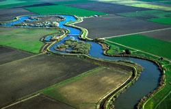
Image, with caption
In basic pages, images can be floated left or right or centered.
Follow the Web Standards for graphics and images (see Images and Graphics).
Example:
How to:
- Click the Drupal WebCMS editor Add Files and Images button.
- Upload a new file, or browse for images in My Files or View Library.
- When uploading a new file, enter a descriptive title for the link text. Add tags to the keywords field so that you can search or browse for the file again.
- On the option screen:
- select the appropriate format
- link to the original image (good for large images)
- select the image alignment
- and add a caption and alternative text, as needed.
Image, gallery
Multiple images, displayed in a grid.
Example:
cols-5.
cols-5.
cols-5.
cols-5.
cols-5.Example code for a three image gallery:
<div class="row cols-3">

	  <div class="col">

	  [image]

	  </div>

	  <div class="col">

	  [image]

	  </div>

	  <div class="col">

	  [image]

	  </div>

	</div>
How to:
- Webmasters must add appropriate code to create up to five columns:
- First, use the Add Files and Images button to add up to five images to the page
- Disable rich-text and wrap the set of images in
<div class="row col-5">- Note: replace the '5' with the number of columns you want (up to five)
- Inside the
col-5div, wrap each image in<div class="col">
- Disable rich-text and wrap the set of images in
Colorbox - Limited to WebMasters
See some examples of Colorbox and what you can do with it.
How to:
- Webmasters add code and JavaScript. See: JavaScript: Colorbox
Widgets Styles
Iframe
An Iframe can be added to any page. It has no associated styles (borders, background colors, etc.), since the content pulled into the space is likely to be highly stylized. Remember to use https:// for EPA assets.
Note: YouTube videos get special treatment: embed the Privacy-enhanced version.
Example
How to:
- In the Drupal WebCMS editor, click the IFrame button.
- In the iframe window, enter values as needed (URL, width and height, alignment, etc.)
- If you're in the WebCMS, you might not be able to see some iframe content because you're pulling in insecure (HTTP) content into a secure (HTTPS) page. Either use the HTTPS version or, if none is available, click on the little "shield" (on the upper left for FF and upper right for Chrome) that allows you to "pass through" the insecure content. The iframe will always be visible once you publish the page.
- Disable rich-text and change to scrolling=”auto” – Drupal currently just gives the option of either scrolling=”yes” or scrolling=”no”
- Disable rich-text. Add a title to the iframe. title="This is the iframe title" Add it in the src code in the WebCMS.
Usability/Accessibility Tip: Be sure to include descriptive text in the Title attribute for screenreaders.
Widgets and Styles Under Development
- video style standard, stay away from overlays because of accessibility issues.
- video slideshow
- Slats: a standard format of an image with text beside it. On microsite homepages will have a gradient background, basic pages do not have gradient.
We will not be implementing a Facebook widget style. Facebook widgets require using code that has privacy issues.
Text
Emphasis (italics)
The <em> element is used to denote text with stressed emphasis, i.e., something you’d pronounce differently. Where italicizing is solely required for stylistic differentiation, the <i> element may be preferable.
Example:
You simply must try the flat white!
How to:
- First, add your content.
- Select or highlight text to be styled.
- Use the Drupal WebCMS editor Italic button.
- To insert an
<i>, disable rich-text, then add code.
Strong (bold)
The <strong> element is used to denote text with strong importance. Where bolding is solely used for stylistic differentiation, the <b> element may be preferable.
Example:
Don’t stick nails in the electrical outlet.
How to:
- First, add your content.
- Select or highlight text to be styled.
- Use the Drupal WebCMS editor Bold button.
- To insert a
<b>, disable rich-text, then add code.
Small
The <small> element is used to represent disclaimers, caveats, legal restrictions, or copyrights (commonly referred to as ‘small print’). It can also be used for attributions or satisfying licensing requirements. The <small> element replaces epaltsans.
Example:
Copyright © 1922-2012 Acme Corporation. All Rights Reserved.
How to:
- First, add your content.
- Select or highlight text.
- Select Small from the Styles dropdown menu.
Mark
The <mark> element is used to highlight text for reference purposes. When used in a quotation it indicates a highlight not originally present but added to bring the reader’s attention to that part of the text. When used in the main prose of a document, it indicates a part of the document that has been highlighted due to its relevance to the user’s current activity.
Example:
I also have some kittens who are visiting me these days. They’re really cute. I think they like my garden! Maybe I should adopt a kitten.
How to:
- First, add your content.
- Select or highlight text to be marked.
- Select Mark from the Styles dropdown menu.
Warning
The warning class is used to highlight text you want highlighted for warning/alert purposes. When used in the main prose of a document, it indicates a part of the document that has been highlighted due to its relevance to the user’s current activity.
Example:
Please be careful downloading this application.
How to:
- First, add your content.
- Select or highlight text to be marked.
- Select Warning from the Styles dropdown menu.
Abbreviation
The <abbr> element is used for any abbreviated text, whether it be acronym, initialism, or otherwise. Generally, it’s less work and useful (enough) to mark up only the first occurrence of any particular abbreviation on a page, and ignore the rest. Any text in the title attribute will appear when the user’s mouse hovers the abbreviation (although notably, this does not work in Internet Explorer for Windows.)
Example:
BBC, HTML, and Staffs.
How to:
- Click the Drupal WebCMS editor Insert Abbreviation button.
- In the abbreviation window, complete the abbreviation and explanation fields.
Code
The <code> element is used to represent fragments of computer code. Useful for technology-oriented sites, not so useful otherwise.
Example:
When you call the activate() method on the robotSnowman object, the eyes glow.
Used in conjunction with the pre element:
function getJello() {
  echo $aDeliciousSnack;
}
Shown with line numbers:
<?phpecho 'Hello World!';?>
How to:
- First, add your content.
- Select or highlight your code text.
- Select Code using the Styles dropdown menu.
Super/ Subscripts
The <sup> element represents a superscript and the <sub> element represents a subscript. These elements must be used only to mark up typographical conventions with specific meanings, not for presentation or visual appeal. As a guide, only use these elements if their absence would change the meaning of the content.
Examples:
The coordinate of the ith point is (xi, yi). For example, the 10th point has coordinate (x10, y10).
f(x, n) = log4xn
How to:
- First, add your content.
- Select or highlight text to be styled.
- Click the Drupal WebCMS editor Superscript or Subscript buttons.
Blockquote
The <blockquote> element represents a section of content that is being quoted from another source.
Do not use blockquote for presentation, as a means to indent text. This negatively impacts the accessibility of your page.
Example, with cite:
Many forms of Government have been tried, and will be tried in this world of sin and woe. No one pretends that democracy is perfect or all-wise. Indeed, it has been said that democracy is the worst form of government except all those other forms that have been tried from time to time.
Winston Churchill, in a speech to the House of Commons. 11th November 1947
How to:
- First, add your content.
- Select or highlight the content, including the author or citation.
- Select the Drupal WebCMS editor Blockquote button.
- Use
<cite>for the title of the work, from the Styles dropdown menu.
Pull quote
A pull quote is a quotation or excerpt taken from the page's content, typically placed in a larger or distinctive typeface on the same page.
Example:
Lorem ipsum dolor sit amet, consectetur adipisicing elit, sed do eiusmod tempor incididunt ut labore et dolore magna aliqua.
Lorem ipsum dolor sit amet, consectetur adipisicing elit, sed do eiusmod tempor incididunt ut labore et dolore magna aliqua. Ut enim ad minim veniam, quis nostrud exercitation ullamco laboris nisi ut aliquip ex ea commodo consequat. Duis aute irure dolor in reprehenderit in voluptate velit esse cillum dolore eu fugiat nulla pariatur. Excepteur sint occaecat cupidatat non proident, sunt in culpa qui officia deserunt mollit anim id est laborum.
How to:
- First, add your content.
- Select or highlight the text, including the author’s name or citation information.
- From the Styles dropdown menu, select Pullquote.
- In front of the author's name, insert a line break
<br />by hitting shift and enter. - Select or highlight the author's name
- From the Styles dropdown menu, select Pullquote Author.
- Add a mdash in front of the Author’s name using the Drupal WebCMS editor Insert Special Character button.
Usability/Accessibility Tip: Screenreaders read the pull quote in line with the rest of your text, so be sure your content still makes sense either with or without the pull quote.
Indented text
Use to indent a section of text, typically to help improve scanning or increase readability of large blocks of content. Do not use in place of the pullquote or blockquote styles, as this negatively impacts the accessibility of your page.
Example:
Lorem ipsum dolor sit amet, consectetur adipiscing elit. Fusce at diam tellus, id feugiat neque. Nunc consequat, eros sit amet dignissim tristique, augue turpis pretium dui, vitae suscipit urna risus eget ipsum. Phasellus sed arcu tellus, in commodo tortor. Fusce arcu sem, varius a elementum ut, viverra a nunc.
Nunc laoreet interdum sem, ut congue odio ultrices et. tristique, augue turpis pretium dui, vitae suscipit urna risus eget ipsum. Phasellus sed arcu tellus, in commodo tortor. Fusce arcu sem, varius a elementum ut, viverra a nunc.
How to:
- First, add your content.
- Highlight or select the content.
- Select Indented Text from the Styles dropdown menu.
Headings
Headings provide the basic organization for a page, grouping content into readable chunks. They are formatted in descending levels of size and emphasis, enabling clear and precise content organization. Headings directly influence search engine results and rankings, and should include key, critical search terms for your page.
Any skipping of heading levels breaks the flow of the page for both disabled and able-bodied users. Choosing to use any heading elements out of order, for purely visual appeal, renders your content less useful and less accessible.
<h1>for the highest level of content organization. At EPA,<h1>is the page title and is part of the template. Additional<h1>tags cannot be added to the page.<h2>provides the main organization or grouping of content, increasing scannability and ease-of-use. The first heading used on a given page is<h2>.<h3>to<h6>break down the content under the<h2>into further sections, leading the user through the page.- These headings should be used as you would an outline structure.
- The Highlighted Heading style applies colored backgrounds to the
<h3>through<h6>levels. See the Highlighted Heading style.
Examples:
Second-Level Heading
The first header on the page, after the page title (which is always <h1>).
Third-Level Heading
Used after the first <h2> header in a document hierarchy.
Fourth-Level Heading
Used after <h3> headers in a document hierarchy.
Fifth-Level Heading
Used after the <h4> headers in a document hierarchy.
Sixth-Level Heading
Used after the <h5> headers in a document hierarchy.
How to:
- First, add your content.
- Select or highlight text.
- Select appropriate heading from format dropdown.
Related links:
Usability/Accessibility Tip: Screenreader users can “skim” text by jumping from heading to heading.
Highlighted Heading
A heading with a background color applied. Used to improve scannability of a web page.
- To avoid chaos, the highlighted heading can only be applied to one heading size per page.
- Don't highlight every heading on a page. This is just noise.
- Use highlighted headings consistently.
- On pages with multiple heading sizes, apply the style to one size, not all. All
<h3>are highlighted, or all<h4>, but not both the<h3>and<h4>headings used on the page. - Do not randomly select multiple headings of various sizes to highlight.
- On pages with multiple heading sizes, apply the style to one size, not all. All
- Works best on text-heavy pages, as the style can easily conflict with images, boxes, and other visual elements such as
<hr>.
Example:
Highlighted H3
How to:
- First, add content.
- Select the highlighted heading from Styles dropdown menu.
Usability/Accessibility Tip: The highlighted heading does improve scannability, but if you use it too often it won’t stand out anymore.
Separators (horizontal rules)
<hr> can help separate content sections.
Example:
How to:
- Select the Drupal WebCMS editor Insert Horizontal Line button from the editor.
Top of Page
Floated right and automatically links to the top of the main content area. A <hr> can also be added to separate content sections, unless Highlighted Headings are used.
Example (see right of page):
How to:
- Select the Drupal WebCMS editor Top of Page button from the editor.
Usability/Accessibility Tip: Include these links at the end of every section on long pages, especially if you used On This Page/ Table of Contents.