Un sitio oficial del Gobierno de Estados Unidos.

This is not the current EPA website. To navigate to the current EPA website, please go to www.epa.gov. This website is historical material reflecting the EPA website as it existed on January 19, 2021. This website is no longer updated and links to external websites and some internal pages may not work. More information »

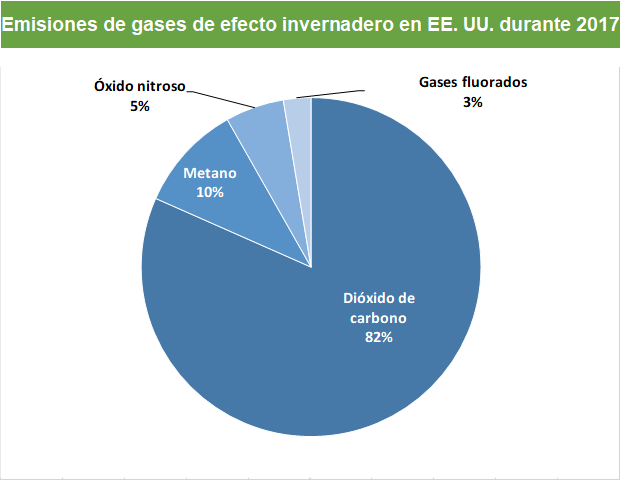
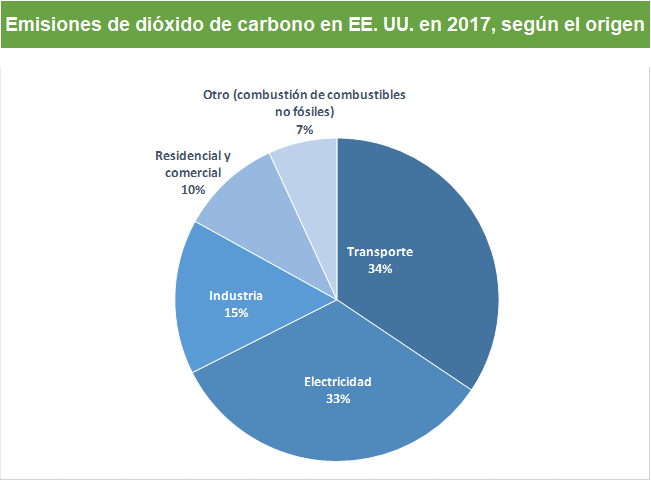
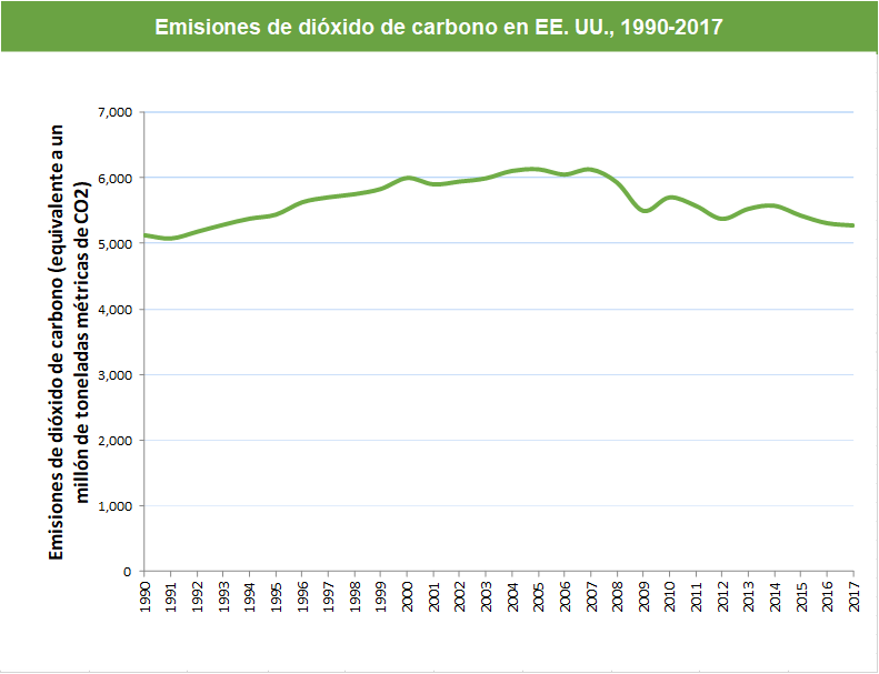
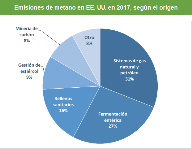
GHG Overview graphics

Pie chart that shows different types of gases. 82% from carbon dioxide fossil fuel use, deforestation, decay of biomass, etc., 10% from methane, 6% from nitrous oxide and 3% from fluorinated gasesPie chart of U.S. carbon dioxide emissions by source. 33% is from electricity, 34% is from transportation, 15% is from industry, 10% is from residential and commercial, and 7% is from other sources (non-fossil fuel combustionLine graph that shows the U.S. carbon dioxide emissions from 1990 to 2017. In 1990 carbon dioxide emissions started around 5,000 million metric tons, peaked in 2007 at around 6,000 million metric tons, decreased to 5,300 million metric tons in 2017

Pie chart of U.S. methane emissions by source. 31% is from natural gas and petroleum systems, 27% is from enteric fermentation, 16% is from landfills, 9% is from manure management, 8% is from coal mining, and 8% is from other sources

Line graph that shows U.S. methane emissions from 1990 to 2017. Methane emissions gradually decreased from around 800 million metric tons of carbon dioxide equivalents in 1990 to around 650 million metric tons of carbon dioxide equivalents in 2017Pie chart of U.S. nitrous oxide emissions by source. 74% is from agricultural soil management, 8% from stationary combustion, 6% from industry or chemical production, 5% from manure management, 5% from transportation, and 2% from other sources

Line graph that shows U.S. nitrous oxide emissions from 1990 to 2017. In 1990 emissions were at about 360 million metric tons of carbon dioxide equivalents. Emissions peaked in 1998 around 390 million, then decreased to around 360 million in 2017Pie chart of U.S. fluorinated gas emissions by source. 90% is from the substitution of ozone depleting substances, 3% from semiconductor manufacture, 3% from electrical transmission and distribution, 3% from HCFC-22 production, and 1% from other sourcesLine graph that shows U.S. fluorinated gas emissions from 1990 to 2017. Fluorinated gas emissions have increased from approximately 100 million metric tons of carbon dioxide equivalents in 1990 to just below 180 in 2017