User Guide for the Excess Food Opportunities Map
The U.S. EPA Excess Food Opportunities Map supports nationwide diversion of excess food from landfills. The interactive map displays the locations of nearly 1.2 million potential industrial, commercial and institutional excess food generators, over 200 communities with residential source separated organics programs and about 5,000 potential recipients. Learn more about this map and its uses.
Below are tips about how to use the map and generate commonly requested views.
- Overview of Map Icons
- Creating Map Views
- Viewing and Filtering Establishment-Level Data
- Downloading Data
Overview of Map Icons
The map landing page displays the following icons. Use them to navigate and display excess food generators and recipients across the nation.
![]() Bookmarks: Quickly navigate to preloaded specified regions of the country.
Bookmarks: Quickly navigate to preloaded specified regions of the country.
 Basemap gallery: Choose from a variety of base maps that provide context for your map view (e.g., topographic, aerial, street).
 ‘Near Me’: Enter a physical address, city, state or zip code and a specified radius to adjust the map view, and see a count of generators in that area.
 Home view: Reset the map to view the entire nation.
 Your location: Zoom to your location on the map.
 Legend: View map layers & icons that have been selected.
 Layer List: View full list of map layers that can be turned on and off.
![]() About: Learn more about the map, including where to download data.
About: Learn more about the map, including where to download data.
 Print: Print the current map view in a variety of formats and layouts.
Create Map Views
View Generators
 Generators appear as colored icons on the map. Top generators can be viewed separately and appear as colored points.
- Navigate to a region of interest using the Bookmarks
 , ‘Near Me’ or Your Location icons the +/- buttons, or by double clicking on the map to zoom in.
 - Select layers from the Layer List to make them appear as icons on the map. Click the Legend to view the complete list of selected layers and their icons/colors.
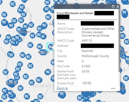
Note: The Top Generators box must be selected in addition to the generator type(s) for top generators to display on the map. The Legend will indicate the relative generation rates for the sizes of circles that appear on the map. - Click on each icon to generate a pop-up box that provides establishment-specific information. See the next section for how to view and filter generator data for multiple establishments.
Note: The map may require additional time to load if viewing large areas. Viewing a smaller area will reduce load time and improve your ability to see individual generators.
Note: The ‘Near Me’ tool will count a maximum of 1,000 establishments for each generator type in the selected radius, as reflected in the pop-up box. If the count is 1,000 for any generator type, consider reducing the ‘Near Me’ radius to get an accurate establishment count for an area, particularly before filtering.
View Recipients
 Recipients are point mapped and also mapped at the zip code and county levels. When viewing recipients, they will appear as colored icons on the map. When viewing recipients by zip code, darker green areas indicate higher recipient densities. When viewing recipients by county, darker purple areas indicate higher recipient densities.
- Navigate to a region of interest using the Bookmarks , ‘Near Me’ or Your Location icons the +/- buttons, or by double clicking on the map to zoom in.
- Select layers from the Layer List to make them appear on the map. Note that the layer category and subcategory must both be selected to display recipients. Click the Legend to view the complete list of layers selected.
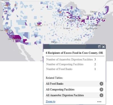
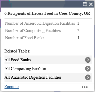
- When viewing recipients by zip code or county, click on any colored area to generate a pop-up box showing count of recipients by type for that zip code or county. When viewing recipients by type (i.e., point mapped), click on each icon to generate a pop-up box that provides facility-specific information. See the next section for now to view and filter recipient data for multiple establishments.
Note: The map may require additional time to load if viewing large areas. Viewing a smaller area will reduce load time.
View and Filter Establishment-Level Data
There are several ways to view a list of establishments in the attribute table. Below is one easy way to do this, as well as a description of how to further filter map layers.
Navigate to a region of interest using the Bookmarks ![]() , ‘Near Me’ or Your Location icons the +/- buttons, or by double clicking on the map to zoom in.
, ‘Near Me’ or Your Location icons the +/- buttons, or by double clicking on the map to zoom in.
View a list of generators
- Open the attribute table by clicking the arrow at the bottom middle of the screen
 . The table will automatically filter to show the generators that are in the map view. Click any generator type in the layer list to see the establishments on the map, too.
 - To view a list of all establishments in the nation for a specific generator type, unclick Filter by Map Extent (this removes the automatic filter). This is a useful feature if you’d like to set up customized filters, as detailed below.
 View a list of recipients
- Select recipients of excess food from the Layer List to view them on the map. Then, click on a county or zip code area to view the pop-up box showing recipient count by type.
- Under Related Tables, click the arrow next to the recipient type of interest.
- In the next pop-up box, click the ellipses (…) in the bottom right and choose View in Attribute Table. The attribute table will open and display records for the specified recipient type and location. To reset a recipient tab so you can once again view the full list, click Refresh in the attribute table.

Sort and filter lists of generators and recipients
- The attribute table presents a tab for each generator and recipient type in the map. You can filter data corresponding to the map view, or you can filter the national dataset. To filter the full list of any generator or recipient type, make sure the Filter by Map Extent button is not selected.

- To sort the listed establishments, click on any column header in a tab and choose Sort Ascending or Sort Descending.
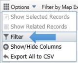
- Filtering must be applied to each tab individually. To begin, select a tab and click the Options button in the upper left corner of the table. Then choose Filter.
- Select Add a Filter Expression to apply one filter, or Add an Expression Set to apply multiple filters. To remove a filter, click the “x” at the end of the expression.
- A dropdown box will appear from which you can choose the field(s) on which you want to filter (e.g., Name, Zip Code, Excess Food Estimate). Then, choose the filter(s) (e.g., is, contains, is greater than), and input the relevant text or numbers. Keep the radio dial button selection set to “Value” and click Okay. The table will update to reflect the filter(s).
Note: The ‘Near Me’ tool will count a maximum of 1,000 establishments for each generator type in the selected radius, as reflected in the pop-up box. If the count is 1,000 for any generator type, consider reducing the ‘Near Me’ radius to get an accurate establishment count for an area, particularly before filtering.
Note: To show or hide columns in a table, click Options, and then Show/Hide Columns to select columns to show or hide.
Download Data
There are two ways to download data: (a) download data from the map interface into a Microsoft Excel document, which is limited to the first 1,000 records in a table, and (b) download a zip file that provides all data in Microsoft Excel as well as the full geodatabase (compatible with GIS software) from the EPA Environmental Dataset Gateway.
Download data directly from the map into a Microsoft Excel document
- Open the attribute table by clicking the arrow at the bottom of the screen .
- Select the tab with the dataset of interest. Filter the data from here if desired. Then, click the Options tab in the table viewer and select Export to CSV. This will export only the first 1,000 rows in the tab being viewed; to export data from multiple layers, do so one tab at a time.
Download data from the EPA Environmental Dataset Gateway (EDG)
Data is available for download in a single zip file that is posted on the EDG website. This file includes a Microsoft Excel document as well as geodatabase files that can be used to create GIS maps. Use this direct link to pull down the zip file (ZIP)(305 MB) Free Viewers and save it to your computer.