Exploratory Data Analysis
Overview
Exploratory Data Analysis (EDA) is an analysis approach that identifies general patterns in the data. These patterns include outliers and features of the data that might be unexpected.
EDA is an important first step in any data analysis. Understanding where outliers occur and how variables are related can help one design statistical analyses that yield meaningful results. In biological monitoring data, sites are likely to be affected by multiple stressors. Thus, initial explorations of stressor correlations are critical before one attempts to relate stressor variables to biological response variables. EDA can provide insights into candidate causes that should included in a causal assessment.
Variable Distributions
On this Page
An initial step in Exploratory Data Analysis (EDA) is to examine how the values of different variables are distributed. Graphical approaches for examining the distribution of the data include histograms, boxplots, cumulative distribution functions, and quantile-quantile (Q-Q) plots. Information on the distribution of values is often useful for selecting appropriate analyses and confirming whether assumptions underlying particular methods are supported (e.g., normally distributed residuals for a least squares regression).
Histograms
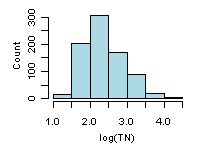 Figure 1. Example histogram from EMAP-West Streams Survey for log-transformed total nitrogen.
A histogram summarizes the distribution of the data by placing observations into intervals (also called classes or bins) and counting the number of observations in each interval. The y-axis can be number of observations, percent of total, fraction of total (or probability), or density (in which the height of the bar multiplied by the width of the interval corresponds to the relative frequency of the interval). The appearance of a histogram can depend on how the intervals are defined. An example of a histogram is shown in Figure 1 for log-transformed total nitrogen from the Environmental Monitoring and Assessment Program (EMAP)-West Streams Survey data set.
Boxplots
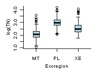 Figure 2. Comparisons of boxplots for log (total nitrogen) from different ecoregions of the western U.S. MT: Mountains, PL: Plains, and XE: Xeric.
A box and whisker plot (also referred to as boxplot) provides a compact summary of the distribution of a variable. A standard boxplot consists of (1) a box defined by the 25th and 75th percentiles, (2) a horizontal line or point on the box at the median, and (3) vertical lines (whiskers) drawn from each hinge (quartile) to the extreme value. In a slight variation of the standard boxplot, whiskers extend to a span distance from the hinge, and outliers beyond the span are identified. The span (S) is calculated as:
S = 1.5 x (75th percentile - 25th percentile)
Boxplots are particularly useful for comparing the distributions of different subsets of a single variable.
Cumulative Distribution Functions (CDF)
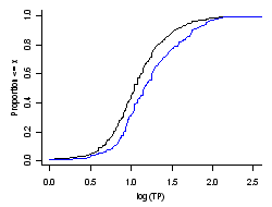 Figure 3. Cumulative distribution functions for phosphorus from EMAP Northeast Lakes Survey data. Black line: unweighted, and blue line: weights as prescribed by the probability design.
The cumulative distribution function CDF is a function F(X) that is the probability that the observations of a variable are not larger than a specified value. The reverse CDF is also frequently used, and it displays the probability that the observations are greater than a specified value. In constructing the CDF, weights (e.g., inclusion probabilities from a probability design) can be used. In this way the probability that a value of the variable in the statistical population is less than a specified value is estimated. Otherwise, for equal weighting of observations, the CDF applies only to the observed values.
CDFs for phosphorus data from the EMAP northeast lakes survey are shown in Figure 3. The CDF for the sampled sites is shown in black (equal weight to the data), while the blue line is the estimated CDF for the statistical population of all lakes in the northeast U.S. (inclusion probabilities from probability design used as weights in estimation). The median phosphorus concentration for all of the lakes sampled is 11 μg/L, while the estimated median for all of the lakes in the northeast U.S. is 17 μg/L.
Q-Q Plots
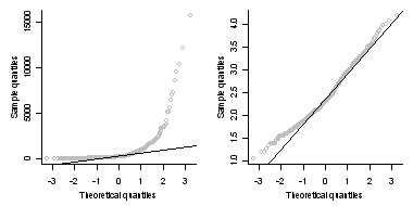 Figure 4. Examples of Q-Q plots comparing total nitrogen (left plot) and log-transformed total nitrogen (right plot) with a normal distribution.
A quantile-quantile (Q-Q) plot, or probability plot, is a graphical means for comparing a variable to a particular, theoretical distribution or to compare it to the distribution of another variable. One common application of the Q-Q plot is to check whether a variable is normally distributed. A comparison of EMAP-West total nitrogen observations and log-transformed total nitrogen observations to a normal distribution are shown in Figure 4. The log-transform greatly increases the degree to which observed total nitrogen values approximate a normal distribution.
Scatterplots
On this Page
- Data Issues that can be Revealed by Scatterplots
- How can I use Scatterplots in Causal Analysis?
- More Information
Scatterplots are graphical displays of matched data plotted with one variable on the horizontal axis and the other variable on the vertical axis. Data are usually plotted with measures of an influential parameter on the horizontal axis (independent variable) and measures of an attribute that may respond to the influential parameter on the vertical axis (dependent variable). Scatterplots are a useful first step in any analysis because they help visualize relationships and identify possible issues (e.g., outliers) that can influence subsequent statistical analyses.
Data Issues that can be Revealed by Scatterplots
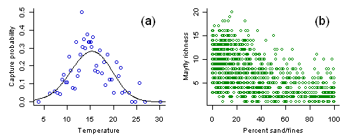 Figure 1.
(a) Capture probability of the caddisfly Calineuria plotted versus stream temperature. Each open circle shows the capture probability estimate from approximately 20 samples with an average temperature as plotted. Line shows a nonparametric regression fit to the data.
(b) Mayfly richness versus percent substrate sand/fines. Variance in observed richness decreases with increased sediment.
How can I use Scatterplots in Causal Analysis?
More Information
- A set of scatter plots showing pairwise relationships between several variables can be conveniently displayed as scatterplot matrix (Figure 2).
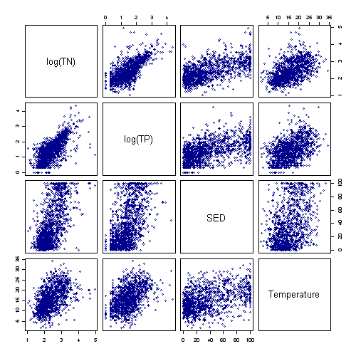 Figure 2. Scatterplot matrix showing relationships between log total nitrogen (log TN), log total phosphorus (log TP), percent substrate sand/fines (SED), and stream temperature in the western United States.
- One limitation of scatterplots is that one can only examine relationships between two variables. In cases in which many different variables interact, multivariate approaches for exploring data may provide greater insights.
Correlation Analysis
On this Page
Correlation analysis is a method for measuring the covariance of two random variables in a matched data set. Covariance is usually expressed as the correlation coefficient of two variables X and Y. The correlation coefficient is a unitless number that varies from -1 to +1. The magnitude of the correlation coefficient is the standardized degree of association between X and Y. The sign is the direction of the association, which can be positive or negative.
Pearson's product-moment correlation coefficient, r, measures the degree of linear association between two variables. Spearman's rank-order correlation coefficient (ρ) uses the ranks of the data, and can provide a more robust estimate of the degree to which two variables are associated. Kendall's tau (τ) has the same underlying assumptions as Spearman's (ρ), but represents the probability that the two variables are ordered nonrandomly.
- A value of r, ρ, or τ is interpreted as follows:
- A coefficient of 0 indicates that the variables are not related (Figure 1, left).
- A negative coefficient indicates that as one variable increases, the other decreases
(Figure 1, center). - A positive coefficient indicates that as one variable increases the other also increases
(Figure 1, right). - Larger absolute values of coefficients indicate stronger associations (e.g., Figure 1, right and center). However, small Pearson coefficients may be due to a nonlinear relationship (Figure 2).
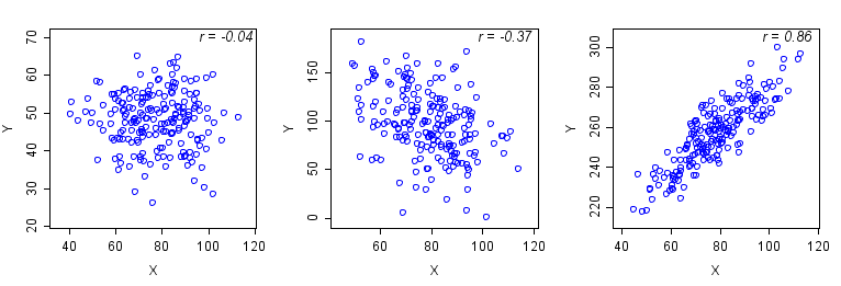 Figure 1. Examples of different correlations between two variables, X and Y.
Left: r = -0.04. The points are diffusely scattered, indicating no association of X and Y.
Center: r = -0.37. The plot indicates a weak negative association in which Y decreases as X increases.
Right: r = 0.86. The scatterplot indicates a linear increase in Y with increasing values of X.
Examples of different behaviors of Pearson's and Spearman's correlations are shown in Figure 2. Pearson's r does not accurately represent the strength of the non-linear association in Figure 2 (left plot). Pearson's r and Spearmans ρ provide different estimates of correlation depending upon the distribution of the data (Figure 2, right plot).
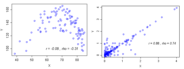 Figure 2. Left plot: Non-linear association measured by r and ρ. Right plot: Linear association with outliers.
How do I Calculate Correlations?
How do I use Correlation in Causal Analysis?
Conditional Probability Analysis (CPA)
On this Page
- How do I Calculate Conditional Probabilities?
- How do I use Conditional Probability Analysis in Causal Analysis?
- Additional Information
Conditional probability is the probability (P) of some event (Y), given the occurrence of some other event (X), and is typically written as P(Y | X). Our application of conditional probability uses a dichotomous response variable, which requires that a threshold value is applied to a continuous response variable that categorizes a sample into one of two categories (e.g., poor quality vs. not not poor quality). For example, here we are interested in sites with a low relative abundance of clinger taxa, compared to total benthic taxa. We categorize sites at which the relative abundance of clingers is less than 40% as "poor" (Figure 1, left plot).
We use CPA to estimate the probability of observing Y (e.g., a site with poor biological condition) if you also observe a particular condition X. Continuing our example, we might be interested in the probability of observing clinger relative abundances less that 40% when the percentage of fine sediments in the substrate exceeds a given value (Xc), or P(Y | X > Xc). An illustrative graph of this relationship is shown in Figure 1 (right plot), where the curve represents the probability of observing a low relative abundance of clingers (i.e., < 40%) when the percentage of sand/fines exceeds a given value. In this example, an increase in the percentages of sand/fines from 0 to 50% was associated with an increase in the probability of observing poor biological conditions (as indicated by the relative abundance of clinger taxa) from 60% to about 80%.
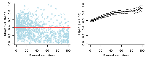 Figure 1. Left plot: Percent substrate sand/fines versus relative abundance of clinger taxa. Data from EMAP-West. Red horizontal line shows relative abundance of clinger taxa = 40%, an example threshold for defining "poor" biological conditions.
Right plot: Conditional probability, P(Y | X > Xc), for X = percent sand/fines fines in stream segment substrate and Y is defined as relative abundance of clingers < 40%. Lines show bootstrapped upper and lower 95% confidence intervals.Conditional probabilities can be calculated by dividing the joint probability of observing both events by the probability of observing the conditioning event (Equation 1).
![]() Equation 1.
Equation 1.
For our purposes, CPA involves the application of the above analysis technique to biological monitoring data to assist stressor identification in causal analysis. Additional background and detail can be found in Paul and McDonald (2005); however, this paper discusses CPA as applied to identifying thresholds of impact, which is a different purpose than stressor identification.
How do I Calculate Conditional Probabilities?
How do I use Conditional Probability in Causal Analysis?
CPA can be used as a data exploration tool. Similar to scatter plots and linear correlation, CPA can be used to help understand associations between pairs of variables (e.g., a stressor and a response).
Additional Information
- Since CPA requires a dichotomous response variable (i.e., there either is, or is not, an effect), you must identify a threshold value of the response metric that defines unacceptable conditions (e.g., a response value that determines if a water body is biologically impaired).
- CPA is most meaningful when applied to field data collected using a randomized, probabilistic sampling design. A probability sample is selected in an explicit manner that allows statements to be made for estimates of the statistical population from which it was selected (Overton 1990). Two key characteristics of a probability sample are that (1) the probability of sampling any element of the statistical population is known (this implies a definition of the statistical population of interest), and (2) the inclusion probability of any sample of the population is positive, that is, all samples have a known non-zero probability of being included in the sample of sites (Cochran 1977, Overton 1993). The inclusion probability of any element is defined as the probability with which the element is included in the statistical population.
- If your sites were selected using a probability design, then their inclusion probabilities can be used to weight the analysis and extrapolate the results to the larger statistical population. For example, if the statistical population was defined as all 1st to 3rd order streams in a watershed, then the results would be representative for all 1st to 3rd order streams in that watershed, not just those stream segments that were sampled.
- If the probability of inclusion of a stream segment is unknown (which is typical for targeted sites or "found" data), the results of the analyses would be expressed in terms of the stream segments for which you have observations, and equal weighting would be applied to the stream segment data.
Multivariate Approaches for Exploring Associations Among Stressor Variables
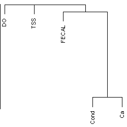 Figure 1. One of many useful methods for exploring associations among stressors, a dendrogram, generated by variable clustering, groups variables that are closely associated based on a measure of association such as Spearman's rank correlation. DO=dissolved oxygen; TSS=total suspended solids; Fecal=fecal coliform; Cond=Conductivity; Ca=Calcium;
Some graphical methods provide, in addition to visualization of relationships among variables, information on stressor profiles for individual sampling locations that may help the analyst to define regions or other groupings of sampling locations with distinctive stressor profiles.
Additional Information
- See the page Multivariate Approaches for Exploring Associations Among Stressor Variables in the Helpful Links box or additional information and examples.
Mapping Data: Spatial Analysis and Geographical Information System (GIS)
On this Page
- In what Watershed does the Study Occur?
- What Rivers and Streams Flow Through the Study Area?
- In what Ecoregion does the Study Area occur?
- What Administrative Boundaries Occur in the Study Area?
- Can Water Quality Monitoring Sites from the Case be Mapped?
- What Software are Available?
- How Do I Use Maps in Causal Analysis?
An important step of a causal analysis is to define and map the spatial extent, or geographical area, of your study area. A map of the study area can help identify other sources of data, facilitate exploratory data analysis, and highlight samples in which spatial autocorrelation may be an issue. Being able to combine data from many different sources is both a strength and a weakness of using a geographical information system (GIS) to produce a map (Waller and Gotway 2004). Brewer (2006) provides some basic principles for mapping data in GIS.
Some common questions to ask when mapping your study area include:
1. In what Watershed does the Study Occur?
The Watershed Boundary Dataset (WBD) provided by U.S. Department of Agriculture’s National Resources Conservation Service on the Geospatial Data Gateway contains the hierarchy and areas for the six nested levels of hydrologic units (region, subregion, basin, subbasin, watershed, and subwatershed). The numbering scheme for the hydrologic units increases by two digits per level, beginning with a two digit hydrologic unit for region and ending with a twelve digit hydrologic unit for subwatershed. The WBD also describes different types of hydrological modification, such as stormwater ditches, levees, navigation canals, at the watershed and subwatershed scales, and such modifications may be candidate causes to consider in the analysis.2. What Rivers and Streams Flow Through the Study Area?
The NHDPlus is a geospatial dataset providing the locations for streams and rivers, and incorporating elements from the National Hydrography Dataset (NHD), the National Elevation Dataset (NED), the National Land Cover Dataset (NLCD), and the WBD. The U.S. Geological Survey web site StreamStats provides stream-flow statistics and drainage-basin characteristics. Data on landscape metrics for catchments from the NHDPlus are available form StreamCat.
3. In what Ecoregion does the Study Area Occur?
An ecoregion is an area with environmental resources that are similar such as vegetation, climate, soils, and geological substrate. Regions with similar topography, climate, and geology are expected to have water bodies that are similar in hydrology and water chemistry. Knowing the ecoregion may allow you to compare the measurements in your study area to measurements from other water bodies in a relevant region or to select the data to be included in exposure-response modeling. Descriptions of the ecoregions and data on ecoregions can be downloaded at the National Atlas web site.
4. What Administrative Boundaries Occur in the Study Area?
The Topographically Integrated Geographic Encoding and Reference (TIGER) data provided by the U.S. Bureau of Census contains county, metropolitan, and urban areas, and the Census Bureau’s demographic data can be linked to the geographic data.
5. Can Water Quality Monitoring Sites from the Case be Mapped?
Other sources for spatial data include state environmental protection agencies and state natural resource agencies. Metadata for these spatial datasets should include information on the coordinate system, spatial extent, and descriptions of the variables, how and when the data were collected, and contact information for the creators and managers of the data.
6. What Software are Available?
A variety of GIS software are currently available, and more are under development. Some of systems we have found useful include ArcMap (ESRI - The GIS Software Leader ), R (CRAN Task View: Analysis of Spatial Data), MapWindow (MapWindow Open Source GIS), and the Geographic Resources Analysis Support System (GRASS GIS). Analysts handling spatial data will need to have a working knowledge of GIS software so that they can perform basic GIS operations such as a spatial query, layering of several different spatial datasets, and buffering. Waller and Gotway (2004) cover some of the fundamentals of using GIS.
7. How Do I use Maps in Causal Analysis?
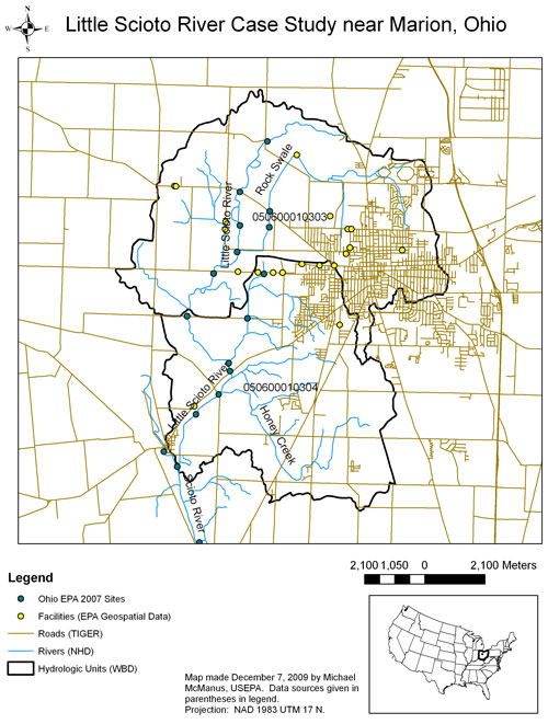 Figure 1. Little Scioto River Map
Norton et al. (2002) and Cormier et al. (2002) performed a causal analysis on the Little Sicoto River, near Marion, Ohio, and we have updated that map (Figure 1) using some of the GIS datasets described above. Besides data on location, these shapefiles also contain other information that may be helpful for causal analysis. For example, the NHD dataset contains the reach code, or reach address. The reach code consists of the 8-digit hydrologic unit number followed by a 6-digit arbitrarily assigned sequence of numbers. This reach code is referenced in data provided by other U.S. EPA programs, such as Impaired Waters and Fish Consumption Advisories (the Reach Address Database). One can also obtain the location and information about facilities and sites in relevant subwatersheds that are subject to environmental regulation from the U.S. EPA Geospatial Data Access Project. For the Little Scioto, the City of Marion’s wastewater treatment plant was identified as a relevant point source using this dataset. Finally, the locations of samples collected by the Ohio EPA were added to the map.
References
- Andersen T, Carstensen J, Hernandez-Garcia E, Duarte CM (2008) Ecological thresholds and regime shifts: approaches to identification. Trends in Ecology & Evolution 24(1):49-57.
- Banerjee S, Carlin BP, Gelfand AE (2004) Hierarchical Modeling and Analysis for Spatial Data. Chapman & Hall/CRC, New York NY.
- Brewer CA (2006) Basic mapping principles for visualizing cancer data using georgraphic information systems (GIS). American Journal of Preventive Medicine 30(2S):25-36.
- Cochran WG (1977) Sampling Techniques. John Wiley & Sons, New York NY.
- Cormier SM, Norton SB, Suter GW II, Altfater D, Counts B (2002) Determining the causes of impairments in the Little Scioto River, Ohio, USA: Part 2. Characterization of causes. Environmental Toxicology and Chemistry 21:1125-1137.
- Crawley MJ (2007) The R Book. Wiley, New York NY.
- Draper NR, Smith H (1981) Applied Regression Analysis (2nd edition). Wiley, New York NY.
- Harrell FE (2001) Regression Modeling Strategies. Springer-Verlag, Inc., New York NY.
- Jolliffe IT (2002) Principal Components Analysis (2nd edition). Springer, New York NY.
- Norton SB, Cormier SM, Suter GW II, Subramaniam B, Lin E, Altfater D, Counts B (2002) Determining probable causes of ecological impairment in the Little Scioto River, Ohio, USA: Part 1. Listing candidate causes and analyzing evidence. Environmental Toxicology and Chemistry 21:1112-1124.
- Ohio EPA (Environmental Protection Agency). (2008) Biological and Water quality Study of the Little Scioto River. State of Ohio Environmental Protection Agency, Division of Surface Water. EAS/2008-1-1.
- Overton WS (1990) A Strategy for Use of Found Samples. Oregon State University, Department of Statistics, Corvallis OR.
- Overton WS (1993) Probability sampling and population inference in monitoring programs. Pp. 470-480 in: Goodchild MF, Parks BO, Steyaeert LT (Eds). Environmental Modeling with GIS. Oxford University Press, New York NY.
- Paul JF, McDonald ME (2005) Development of empirical, geographically-specific water quality criteria: a conditional probability analysis approach. Journal of the American Water Resources Association 41(5):1211-1223.
- Ryan, TP (2009) Modern Regression Methods. Wiley, New York.
- USGS (U.S. Geological Service), USDA (U.S. Department of Agriculture), NRCS (Natural Resources Conservation Service) (2009) Federal Guidelines, Requirements, and Procedures for the National Watershed Boundary Dataset. U.S. Geological Survey Techniques and Methods. 11-A3. 55 pp.
- Waller LA, Gotway CA (2004) Applied Spatial Statistics for Public Health Data. John Wiley and Sons, New York NY.
- Volume 4: Authors