Guide to the ROE
Explore the Website
The 80+ ROE indicators help answer 23 questions in five theme areas (Air, Water, Land, Human Exposure and Health, and Ecological Condition) critical to EPA's mission of protecting the environment and human health. To explore the website:
- ROE Indicators:
- Visit Explore ROE Indicators, where you can browse and filter the list of ROE indicators and navigate to any indicator.
- On any indicator page, use the "Report on the Environment" link at the top of the page to return to the home page.
- All other pages:
- Use the navigation menu to visit the ROE home page, theme area pages, and other pages of interest and to "Advance ROE Search."
To print theme area and question topic pages:
- Right click your mouse or click on the “File” menu in your browser.
- Select “Print preview” or “Print” to view the text you'll be printing and confirm it contains the content you selected.
- Print the file.
Explore an Indicator
Each indicator contains a variety of interactive features. Use the numbered guide below to learn more.
- ROE Homepage. Use the "Report on the Environment" link to return to the home page.
- Indicator name. Some indicators' names have two forms: a full name (shown here) and a shorter form that may be used in lists and cross-references. For example, the indicator “Population Served by Community Water Systems with No Reported Violations of Health-Based Standards” is referred to elsewhere as the “Drinking Water” indicator.
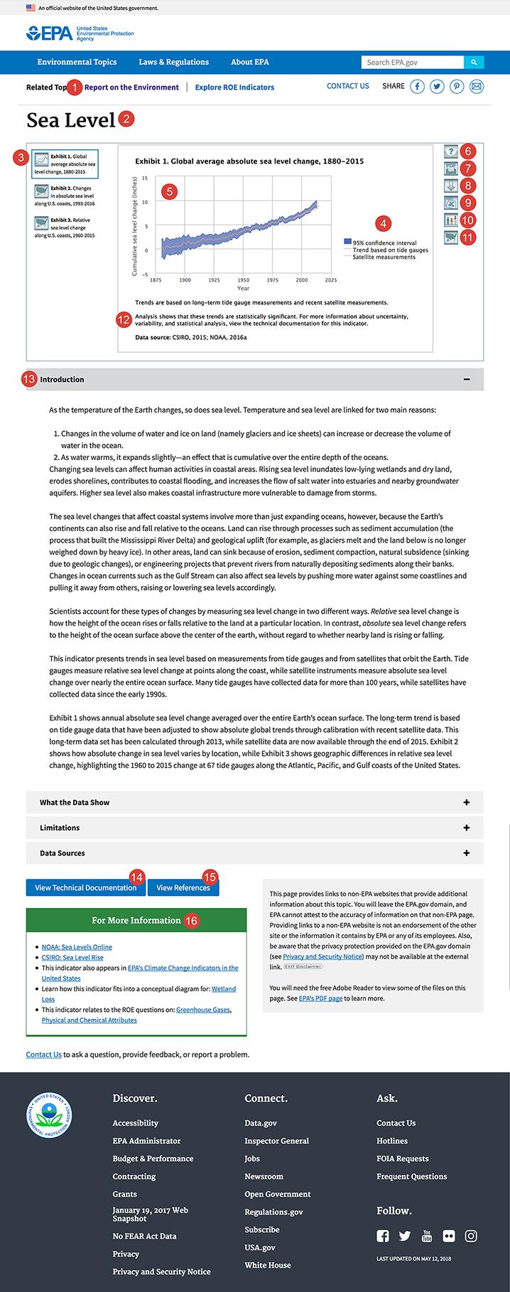
- Select an exhibit to view. Each indicator can have one or more exhibits (graphs, tables, or maps). You can view one exhibit at a time by selecting the corresponding thumbnail from the left side of the screen. The selected thumbnail will be surrounded by a blue box.
- Turn layers on or off. In graphs with multiple data series (e.g., multiple lines), you can choose which series you wish to display. This can be useful if you want to focus on a particular category or a particular region, for example. You can toggle individual data series on or off using the clickable legend. In the example above, you can click the words “Trend based on tide gauges” and/or “Satellite measurements” to remove those data from the display. Click again to turn those layers back on. When a series is turned off, its name will appear gray in the legend, rather than black.
- See individual data points. Hover your mouse over a bar segment, any point along a line, or the top of a shaded area segment to reveal a tooltip with data.
- Help button. This button opens a popup with instructions on how to use the ROE website, including interactive indicator features.
- Indicator PDF/print button. This button generates a PDF of the complete indicator, including all exhibits and all text (but not including the separate technical documentation). Each exhibit will appear in its default state—i.e., with all data series turned on. (To print an exhibit with one or more data series turned off, see #8 below.) Depending on your browser, you may be prompted to open or save this PDF. The best way to print a complete indicator is by generating and then printing a PDF.This method is more reliable than selecting File -> Print within your browser.
- Exhibit download/print button. This button will export the exhibit that is currently onscreen as a PNG (bitmap image) file. The exhibit will appear in its current state—i.e., showing only the data series that are currently turned on. You may wish to use this tool to get a version of the graphic that you can paste into a document, presentation, social media application, or other location. You can also use the PNG file to print a hard copy. Depending on your browser, you may be prompted to open or save this file.
- Data button. This button provides the data for the current exhibit in a downloadable tab-delimited file. You can open this file with a spreadsheet program such as Microsoft Excel. Depending on your browser, you may be prompted to open or save this file.
- Statistical information button. Certain exhibits have error bars, confidence bands, or trend lines that can be added to the display to provide statistical context. These features are turned off by default, but can be turned on by selecting this button:
 .
. - Locator map button. This button appears next to selected exhibits that disaggregate data by geographic region. It opens a popup containing a map that shows the relevant regional boundaries.
- Trend statement. A footnote beneath every ROE exhibit explains what is known about any trends in the data over time, if applicable.
- Indicator text. Each indicator has four sections of text: Introduction (background), What the Data Show (key points), Limitations, and Data Sources. Select a heading to expand the page and read the text.
- Technical documentation. Each indicator has a corresponding technical document that provides more details about data sources, methods of collecting and analyzing data, and statistical attributes. Selecting this link will open the technical documentation in a popup window.
- References. This link opens a popup window with full citations for the references that are cited within the indicator text.
- For more information. This box provides links to other EPA or non-EPA websites where you can find more information about the indicator data or the topic in general. This box also lists the ROE questions that the indicator addresses. Additionally, some indicators link to a series of diagrams that show how ROE indicators relate to selected issues of environmental concern.
Special Tools for Interactive Maps
A few ROE indicators include interactive maps. Use the numbered guide below to learn about special features of these maps.
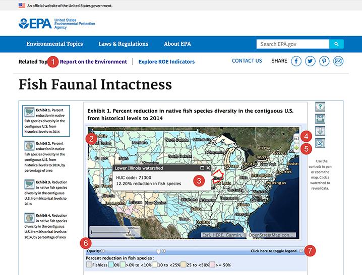
- ROE Homepage. Use the "Report on the Environment" link to return to the home page.
- Zooming and panning tools. Use the “plus” and “minus” buttons to zoom in or out, and use the arrows to move around on the map.
- Popups with data. Some maps present data for specific points (e.g., sampling stations) or regions (e.g., watersheds). If applicable, you can click one of these points or regions to open a popup with data.
- Full screen view. Select the button in the upper right corner of the map to open a larger version.
- Turn layers on or off. The “+” button along the right edge of the map will open a list of layers that can be activated or deactivated. Data layers are activated by default. You can choose whether you want the basemap to be a satellite image or a plain gray background.
- Opacity control. Use the slider near the bottom of the screen to change the opacity (transparency) of the main data layer. For example, if the main data layer has colored areas or grid cells, you might wish to make this layer more transparent so you can see features of the basemap beneath.
- Legend control. Open the legend to view its contents. Close the legend to leave more space for viewing the map.
Note that a few of the interactive buttons that work for graphs and tables might not apply to maps. For example, some complex raster (grid) maps do not offer the ability to download data in spreadsheet format, in which case the “data” button will not appear. Also, depending on a number of factors, certain maps may take a few seconds to load.
Statistical Information
The ROE displays confidence intervals (in the form of error bars or bands) and trend lines as optional overlays to indicator graphics when such data are readily available and straightforward to add to the graph. Additional details about uncertainty, variability, and statistical analysis (for example, analysis of trends over time) can be found in the technical documentation for each indicator. A footnote beneath every ROE exhibit explains what is known about any trends in the data over time, if applicable.
The presence of the statistical information button ![]() to the right of a graph signals the availability of confidence intervals or trend lines that can be added to the display. Click on this button to view the available statistical information.
to the right of a graph signals the availability of confidence intervals or trend lines that can be added to the display. Click on this button to view the available statistical information.
- Confidence intervals. For ROE indicators, confidence intervals are displayed visually in the form of error bars on a bar graph or a shaded band on a line graph.
- Trend lines. The ROE considers trends to be statistically significant if they reach a level of confidence that is generally viewed as appropriate for the topic at hand. In most cases, the threshold is 95 percent confidence. Where feasible, trend lines may be displayed in ROE exhibits for trends that are statistically significant. To see the slope of the trend, view the legend or the tooltip that appears when hovering over the line. The technical documentation describes how each trend was calculated and provides the p-value, which indicates the level of significance. In a few cases, the technical documentation may explain that a trend was calculated but determined to be insignificant, in which case no trend line is shown on the graph.
See Frequent Questions for more information about confidence intervals and trend lines in the ROE.