EasyRSEI Online Help
EasyRSEI is an easy-to-use dashboard that provides simplified access to results from EPA's Risk-Screening Environmental Indicators (RSEI) model. With EasyRSEI, you can browse through and customize charts, maps, and tables and select the data you are interested in for specific facilities, locations, chemicals and years. Screenshots and data can be exported from EasyRSEI. The EasyRSEI Dashboard is easily accessible through any browser and device by using the Qlik Sense® platform. The EasyRSEI Dashboard contains the most recent eleven years of RSEI data; a separate dashboard with all years (1988 to current) is also available for interested users.
To see information about the pages in the EasyRSEI Dashboard, click on the sections below:
Making Selections
Understanding How to Select Data
By default, the dataset included in a Qlik Sense® application is the entire dataset. By making a selection on the dataset, you can begin to focus in on a subset of the data and drill down to insights and narratives that might not be as apparent when looking at the entire dataset at once. For example, trends in chemical releases in a certain geographical area might not be visible until you begin to narrow the selection of your dataset to a specific country, state, county, etc.
Qlik Sense® is based on an associative model, which means that any selections on the dataset will output the subset of data that is possible based on the selections. Qlik Sense® uses color-coding to differentiate between different selection states and possible options for filtering the data.
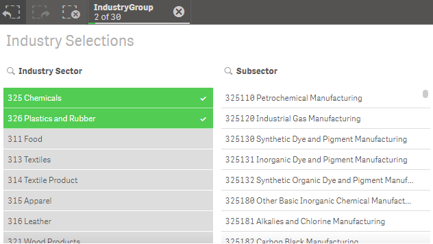 For example, if you filter your data by selecting "325 Chemicals" and "326 Plastics and Rubber" from the Industry Sector field, the subset of data will be any records where "325 Chemicals" or "326 Plastics and Rubber" is the value in the Industry Sector field - "325 Chemicals" and "326 Plastics and Rubber" are both in the selected state. All other values in the Industry Sector field are alternative states. Within "325 Chemicals" and "326 Plastics and Rubber" are many subsectors that are denoted as possible states because, though not selected, they are possible given the current selection state.
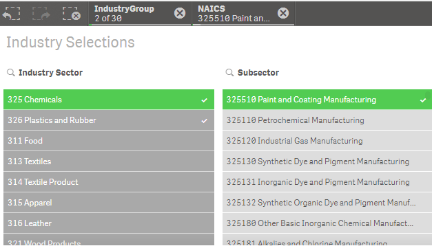 If you then select "325510 Paint and Coating Manufacturing" in the Subsector field, then those other subsectors in "325 Chemicals" and "326 Plastics and Rubber" become alternative states. Industry sectors besides "325 Chemicals" and the subsectors in those groups now become excluded states because they are not possible given the selection on both "325 Chemicals" and "325510 Paint and Coating Manufacturing." Note that, since "326 Plastics and Rubber" is still a selected industry sector, but it is not a possible value given the selection of "325510 Paint and Coating Manufacturing," it is denoted as a selected excluded state.
How to Filter Data
Using a Filter Pane
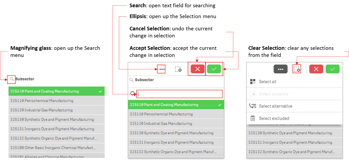
One of the objects used in Qlik Sense® applications is the filter pane. Filter panes can be used to provide additional flexibility in how values are selected from a given field. As shown below, filter panes can be used to search directly on all of the values using an open text field. The Selection menu, shown in the far right, allows you to quickly select all values or change to other selection states. In this example, if “Select alternative” were selected, all subsectors besides “325510 Paint and Coating Manufacturing” would become selected, and “325510 Paint and Coating Manufacturing” would become an alternative state.
Types of Selection Methods
You can interact with any Qlik visualization (chart, map, table, etc.) to make selections.
- Click: Click on at least one value or data point to include them in the current selection. For example, you can click on a pie chart slice to select the dimension associated with that slice.
- Draw/Lasso: Click inside the object and turn on the lasso selection to draw a freehand line and select multiple values or data points at once.
- Label: Click on dimensions labels to select those dimensions.
- Range: Click on a range of values in either the x- or y-axis of a chart to select those values.
Searching for Data
Qlik Sense® provides many search options to help you find specific subsets of the data included in a dashboard. After typing in the search string, hit enter to make the selection.
Types of Searches
Qlik Sense ® allows for several different search methods, described below.
Text search
Text search allows for searching by string(s). Additional options include using quotation marks to combine strings and search for only the entire string rather than individually, or using plus or minus signs to include or exclude certain strings. Wildcards may also be used. For example, "*" can be a placeholder for any number of characters, whereas "?" is a placeholder for a single character.
 Fuzzy search
Placing a “~” character at the beginning of search string allows for fuzzy matching, which displays results that are similar to the search string(s) but not necessarily exact matches.
Numeric search
Numeric values can be searched using relational operators to find values greater than, less than, and/or equal to the search string value.
Expression search
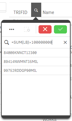
An expression search string can also be used to filter values, as shown at the right where an expression search string in the TRIFID field identifies those facilities which reported more than 100,000,000 pounds of releases under the current selection state..
Additional Information
In addition to the full quick start guide Exit, Qlik provides documentation for many of the features included in Qlik Sense® in a searchable webpage format. Exit
General Information
Filters and Options Menu
The filters and options menu is available by clicking on the gears icon at the top right of the screen. Use the RSEI Value Option dropdown to change the values shown in the dashboard objects from RSEI Score to RSEI Modeled Hazard or other types of RSEI results. Additional filters control what subset of data is shown in your current selection. All of the selections made on this menu will affect all of the pages in the dashboard (except for the National Trend page). For example, if you select RSEI Modeled Hazard from the RSEI Value Options menu and then select California from the State filter, all of the objects in the dashboard will show only RSEI Modeled Hazard data from facilities in California. Click anywhere on the dashboard to hide the menu again. The filters in this menu do not reflect all of the possible filters that can be applied to the data, but provide quick and easy access to those that are most likely to be of interest.
Page-Specific Filters
Several pages have additional filters, like the filter on the Summary and Analysis pages to switch from RSEI values for modeled media. These page-specific filters do not influence the selections on other pages.
Selection Toolbar
The selection toolbar shows at the top of every page and indicates which filters are currently active. You can click on any filter in the toolbar to modify or delete that selection. The buttons at the left allow you to step back or forward through the current selection, or clear it entirely.
Pop-Ups
Selection State Information
The selection state information pop-up is available by clicking on the information icon in the top right. This will display any caveats about the data that are pertinent to your current selection state. For example, if the selection includes years after 1997, the pop-up includes a section explaining that additional industry sectors were added to TRI reporting beginning with Reporting Year 1998.
Help
The help pop-up is available by clicking on the question mark icon in the top right. This pop-up includes some general guidance for using the EasyRSEI Dashboard, such as how to toggle individual Qlik objects into a full-screen view or download screenshots of each object.
Navigation Bar
The navigation toolbar along the left-hand side allows your to move through the different pages within the dashboard. Each page is described in further detail below.
National Trend
The first page included in the EasyRSEI Dashboard provides an overview of the national trends for both RSEI Modeled Hazard and RSEI Score.  The two bar charts on this page are intended to provide a direct comparison to the national trend charts included in the TRI National Analysis. These two charts are restricted from responding to any selections in the dashboard, and will always display the national trend for RSEI Modeled Hazard and RSEI Score for the most recent years of data. Both charts also include the quantity of pounds reported to TRI and modeled by RSEI.
Important: The National Trend page is the only page in the dashboard that does not respond to filter or value option selections.
Location
The location page shows the currently selected facilities and provides further options for selection and mapping based on geography. 
The top of the page shows four key performance indicators (KPIs) based on your current selection: the number of facilities reporting to TRI, the number of TRI reports, the number of reporting years and the total RSEI Score. Below the KPIs, you can use map functions to explore and refine your selections.
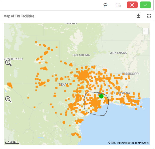
The first tab, "Map Current Selection" shows all TRI-reporting facilities in the current selection. If you have a large number of facilities, it may take some time to show them all on the map, and if you are using the All Years dashboard, some selections may exceed the approximately 32,000 limit on the number of facilities that can be mapped at once.
You can make selections on the map by clicking individual facilities or by using the lasso function. To use the lasso, click on the map to activate the tools, then click on the lasso tool icon at the top of the map. Draw a circle around the facilities you want to select, then click the green checkmark in the top right corner of the map to confirm your selection.
 →
→ 
On the second tab, "Find TRI Facilities Near You," you can input a location address and click "Search" to see all TRI-reporting facilities in your current selection that are also within a certain distance from that location. The distance is determined by the slider at the bottom of the screen.
The third tab allows you to “Select Facilities Using Filters.” You can refine your current selection by State, County, City, ZIP Code or Tribe. Remember to click the green check mark to confirm each selection.
Map Display Options. Click the ![]() icon to change the map layer. The available layers may change depending on the zoom level and selection. The most useful map layers are:
icon to change the map layer. The available layers may change depending on the zoom level and selection. The most useful map layers are:
- Background Landuse - Stylized water, green space and developed area.
- Satellite Layer - Detailed satellite imagery.
- Borders - State and international borders and labels.
- Roads - Highways and local road geometries.
- Points - City and town labels.
- TRI Facilities - Facilities in your selection.
- Background Labels - Controls city and state/country labels (the labels from Points layer and Borders layer).
Summary
The Summary page includes three different views of RSEI data that provide a summary of the results based on the current selection. On this page, the default view is RSEI Values for modeled media (pounds, hazard and scores for the kinds of releases that RSEI fully models and for which scores can be calculated- direct air and water releases, and transfers to POTWs or off-site incineration). You can use the toggle to select TRI Values for all media, then select from the drop-down menu to show TRI Pounds, RSEI Hazard, RSEI Cancer Hazard, or RSEI Noncancer Hazard. The charts on all the tabs on this page only will then show the values for all media reported to TRI in Sections 5 or 6 of the Form R.
The "Overview" tab presents different charts and maps of RSEI results. The charts include a bar chart showing the trend of RSEI results by media and year; a map displaying the RSEI results by state; and pie charts which include RSEI results by industry group, location, and chemical.  Both the industry sector and location pie charts drill down into more detailed categories after an initial selection (e.g., if you click on the Region 4 slice in the EPA Region pie chart, the chart will change to Region 4 chart showing the state breakdown). All of these charts show the RSEI Score by default, but can be changed to show different RSEI Value options using the RSEI Value Options dropdown menu.
The "Top Facilities" tab lists all facilities included in the current selection. Each facility’s unique TRI identifier (TRIFID), name, city and state are listed, along with the selected RSEI Value or TRI Value selected at the top of the page or in the Filter Options menu at right. For comparative purposes, the table also provides “TRI Pounds” which is the total of all pounds released or transferred for that facility (subject to whatever filters are selected). See Understanding RSEI Results for more information).
The "Industry Sectors" tab allows a more focused look at RSEI results for a given industry. If no industries are currently selected, the first pie chart will show the distribution of the selected RSEI Value across industry sector (by 3 or 4 digit NAICS code), and the bar graph will show the value for each sector over time.  You can select one or more industry grouping using the three lists at the top of the screen. If you select one or more sectors in the first list, the values in the other lists will change color based on their relationship to what you selected- green means selected, white means currently possible/included, dark gray means excluded, and light grey means alternative, or that it is selectable given your current selections. See “Making Selections” above for more information on selecting data in Qlik. Any selections you make in the lists will be reflected in the charts.
Analysis
The "Overview" tab includes a pivot table, which provides the RSEI or TRI Value calculated for a series of dimensions.  The four dimensions included in the pivot table are Chemical, Media, Facility ID, and Year. In the initial view, values are calculated by chemical (row) and year (column). Use the plus sign buttons to expand the rows to show media- and facility-level calculations as well. Values are sorted in descending order for the most recent year and the highest level dimension in the current selection.
On this page, the default view is the RSEI Score from the RSEI Values for modeled media (the kinds of releases that RSEI fully models and for which RSEI calculates scores- direct air and water releases, and transfers to POTWs or off-site incineration). You can use the toggle to select TRI Values for all media, then select from the drop-down menu to show TRI Pounds, RSEI Hazard, RSEI Cancer Hazard, or RSEI Noncancer Hazard. The charts on this page only will then show the values for all media reported to TRI in Sections 5 or 6 of the Form R. Note your selection will affect all of the tabs in this page.
You can reorganize the dimensions by dragging the dimension name into a different order in either the rows or columns.
In addition to the "Overview" tab, the Analysis page also includes three tabs to view results with a specific focus on chemicals, media, and facilities. These tabs include similar charts, but show different dimensions.
 On the "Custom Export Table" tab, you can build a table based on your current selections that can be downloaded into an MS Excel spreadsheet. Under "Data Sets", select RSEI Value Dimensions if you want to look at modeled pounds, modeled hazard or scores for modeled media; select TRI Value Dimensions for pounds and hazard for all TRI-reported releases and transfers. The default settings for the table will show RSEI values by submission year and facility ID, but you can select additional dimensions and measures in the lists on the leftside of the table. When selected, a dimension or measure will show in the list at the top of the table. You can reorder the columns by clicking and dragging the names. To export your data, right-click anywhere on the table and select "Export Data".
Transfers
RSEI only fully models transfers to two kinds of off-site facilities: publicly-owned treatment works (POTWs) and off-site incinerators. However, TRI collects information for many other types of transfers, and RSEI calculates hazard values (toxicity-weighted pounds) for many of them.  Transfers of all types are presented in the Transfers page of the dashboard, unlike the other pages, which only include releases and transfers that are modeled. When you click on the transfers page, you will get a pop-up reminding you that the Transfers page includes more transfers than the other pages in the EasyRSEI dashboard.
The Transfers page includes data on pounds transferred, how the waste transferred was managed, and information about the origin and receiving facilities included in your current selection. By default, only states will show in the map. You can click the “Show” button to show the off-site transfers associated with your current selection; the default is to show the 50 largest transfers (by whatever value is selected), but you can change that using the slider at the right.
There are several ways to filter on this page:
- Use the filters and options menu under the
 icon at the top right. Note that the RSEI Value Options dropdown menu will not affect this page, since this page contains more than just modeled releases and transfers (use the dropdown on this page instead). All other filters will work on this page.
 - From the dropdown menus at the top, select an origin state(s) (facilities located in this state transferring waste to an off-site facility) and/or receiving state(s) (facilities located in this state receiving waste from a TRI-reporting facility). To view in-state transfers, select the same state from both dropdown menus. Note that in the selection bar at the top of the screen, origin state/territory is labeled “State.”
- Click on a facility on the map, or an arrow to select just that transfer. You can select multiple facilities, arrows or a combination. Remember to click the green check mark when you are done to confirm your selection.
- Click on a state on the map to show transfers into that state, as well as the facilities that make the transfers.
- Waste Treatment Type – this chart separates all transfers into five types: treatment, transfers to POTWs, energy recovery, disposal, or recycling. Your selection will show in the selection bar as “Mtype”.
- Waste Transferred by Chemical – This selects the chemical transferred, and is equivalent to the chemical filter in the filters and options menu.
- Waste Transfers Outside U.S.- This chart shows the destination by region of all transfers that go outside the U.S. and its territories. To see transfers that go to Asia, for example, click on the pink pie slice labeled “Asia.” Your selection will show in the selection bar as “Global Region.”
- Select one or more facilities from the facility lists. The two tables at the bottom of the page list all of the origin facilities and receiving facilities. The
 icon at the top right of each table expands the table so all fields are visible.
Waste Managed
The Waste Managed page includes data from Section 8 of the TRI Form R, where facilities report data elements mandated by Section 6607 of the Pollution Prevention Act of 1990.  For more information on these data elements, see the “Waste Management Information in TRI” section of the Factors to Consider When Using Toxics Release Inventory Data document.
Waste management categories are not modeled by RSEI, but hazard values are calculated for all chemicals with toxicity weights. Note that some of the waste management categories, such as "Disposed or otherwise released," represent the same waste quantities that are reported in Sections 5 and 6 of Form R, and are shown in the other pages of this dashboard, and cannot be summed with quantities from those sections.
Report
The Report page of the dashboard brings together basic information about your selection into printable reports, including charts and maps from the other pages, along with explanatory text to help you understand the graphics.
Your selection determines which reports are available for viewing. When you click the Report icon, the most relevant report will be opened for you; if there are any other reports available, they will be shown as blue buttons at the top of the page. There are currently four kinds of reports:
Summary of Selected Data
- Trend for Selected Data: RSEI Score by media and year
- Overview of Releases and Transfers: a table of pounds, RSEI Hazard, and RSEI Score by media (includes unmodeled media)
- Top Facilities: RSEI Score for the top 5 facilities, broken down by media
- Top Chemicals: RSEI Score for the top 10 industries, broken down by the top 10 chemicals in each industry
- Facility List: a list of the facilities included in the current selection state
Geographic Report
This report is always available and contains the following features:
- Facility Summary with map
- Top Facilities: RSEI Score for the top 5 facilities, broken down by media
- Overview of Releases and Transfers: a table of pounds, RSEI Hazard, and RSEI Score by media (includes unmodeled media)
- Top Chemicals for Air and Water Releases
- Trends by Media and Year
Facility Report
This report is available when only one facility is in your selection set and contains the following features:
- Facility information: location, contact information, and EPA Program IDs
- RSEI Facility Score: RSEI Score my media and year. Information about chromium and chromium compounds releases will display if the facility reported this metal and/or metal compounds.
- Media-Specific Information: For each possible media type, a description of those releases along with charts displaying the RSEI Score over time and by chemical for the facility will be shown. If the facility did not report releases for a specific media type, no information will be shown.
Off-Site Report
This report is available when one or more off-site facility is in your selection set and contains the following features:
- Key performance indicators (KPIs) describing the number of transfers, the pounds transferred, and the number of receiving and origin facilities.
- Waste Transfers by Method and Year: Pounds of waste by each of five transfer method (Mtype).
- Overview of Off-Site Transfers (All Years Combined): Pounds, RSEI Hazard, and RSEI Score by transfer type.
- Transfers from TRI Reporting Facilities to Off-Site Receiving Facilities: Transfers Map showing pounds transferred.
- Tables listing the origin facilities and receiving facilities in your set.
Each report also lists your current selection at the bottom of the report, to document the universe of releases presented in the report.
Note that the objects in the reports are selectable like they are in the rest of the dashboard. If you click on a bar or pie slice, you can select that parameter by clicking on the green check mark.
Modeling Data
 If only one chemical is included in the current selection state, the Chemical Modeling Data tab (shown at right) displays information specific to that chemical. Types of data include identifiers and EPA program flags, as well as toxicity and physicochemical information used for modeling purposes.
Similarly, if only one facility is included in the current selection state, the Facility Modeling Data tab displays information specific to that facility. Types of data include identifiers, locational data, water modeling data, air modeling data, and other information about the facility such as contact information.