Basic Analyses
Tests of Significant Difference
On this Page
Tests of significant differences most commonly test whether the difference between two mean values is significantly different from zero (Snedecor and Cochran 1989). However, in causal assessment, a more common question is whether an observation at a test site deviates significantly from the range of conditions observed at a reference site. For example, we may wish to compare total phosphorus concentrations (TP) at a biologically-degraded test site with TP at one similar reference site with unimpaired biota to establish whether elevated TP co-occurs with the observed biological degradation (see page on spatial co-occurrence).
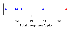 Figure 1. Example of comparing a single test site observation with of total phosphorus (red dot) with five samples collected at a reference site (blue dots).Consider the case in which 5 measurements of TP collected at different times at the reference site range from 10 - 16 µg/L (Figure 1). At the test site, a single observation of TP = 19 µg/L is available. We would like to know the probability that the TP concentration observed at the test site would have been observed at the reference site. If this probability is low (e.g., less than 5%), then we could conclude that TP concentrations differ at the test site compared to the reference site.
Non-Parametric Approaches
A simple approach for estimating the probability of observing a particular value relative to a set of reference observations is to note that the reference observations define a range of possibilities. That is, nitrogen (N) random reference observations at a site divide the range of possible values into N +1 intervals. Therefore, the probability that a subsequent observation is higher than the highest reference value is 1/(N +1). In the example described above, the probability of observing any observation greater than 16 is 1/(5+1), or 17%. More samples at the reference site would increase our ability to assert whether the observation at the test site could come from the reference site (i.e., that the test site is similar to the reference site).
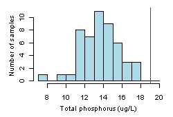 Figure 2. Histogram showing distribution of total phosphorus values at a reference site. Red vertical line shows the test site value.With a larger number of reference samples, one might specify a threshold probability p (e.g., p = 0.05) below which a test site value would be declared to be outside the range of reference conditions. Returning to our example, and considering the case in which 50 samples are available (in Figure 2), one could state a priori that a test site TP greater than the 95th percentile of the distribution is unlikely to be part of the reference distribution, and therefore, the test site TP is different from reference. In this case, the 95th percentile is 17 µg/L, the observation of TP = 19 µg/L is greater than this threshold, and we declare that TP at the test site differs from reference expectations.
Parametric Approaches
Parametric estimates of prediction intervals can provide more informative comparisons than non-parametric techniques, but they require larger sample sizes, and they require that we assume that the observed values are drawn from a particular statistical distribution (e.g., a normal distribution). TP values shown (in Figure 2) appear to be normally distributed, and we calculate the sample mean value (Xmean ) as 13.6 and standard deviation (S) as 2.05. A quantile-quantile plot (not shown) confirms that values are nearly normally distributed. We can estimate the 95th percentile of the distribution using the following formula:
![]()
where Xt is the threshold associated with the 95th percentile of the distribution and t0.95 is the t-statistic for the 95th percentile with 50 degrees of freedom. In this example, the threshold is estimated as 17 µg/L, and our test site with TP = 19 µg/L is declared to be different from the reference distribution.
More Information
The discussion here has focused on comparing a single test site measurement with a set of samples collected at different times from a single reference site. The same types of tests could also be applied to a set of samples collected from multiple reference sites, if we were confident that the natural expectations at all of the references sites were identical. In practice, different streams are likely to vary in terms of natural expectations, and test site comparisons should take these natural variations into account. Quantile regression and prediction intervals from linear regression extend these ideas to situations in which one needs to control for the influence of one or more covarying factors
The number of samples available at the reference site often limits our ability to determine whether a test site differs from reference expectations. In cases in which the number of reference samples is low (e.g., < 5), pooling samples from other sites to estimate a within-site standard deviation may be necessary.
Statistical methods to explicitly formulate the null hypothesis in terms of a range of possible values are available and discussed in Kilgour et al. (1998).
Regression Analysis
On this Page
- How do I Run a Regression Analysis?
- What do Regression Results Mean?
- How do I Use Regression Analysis in Causal Analysis?
- More Information
Linear regression is an approach for quantifying the relationship between a dependent (response) variable and one or more independent (explanatory) variables. The relationship is often assumed to be a straight line, but may also be curvilinear or nonlinear.
How do I Run a Regression Analysis?
A regression tool is available in CADStat. Linear regression tools are also available in most spreadsheets and statistical programs.
What do Regression Results Mean?
After running a linear regression, most programs will provide statistics that describe the characteristics of the estimated fit to the data. These statistics include estimated values for the coefficients, the standard errors and p-values for those coefficients, and a measure of the degree the model accounted for observed variability in the response relative to a constant, null model (R2). Several existing resources provide complete explanations for these different statistics.
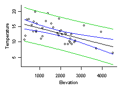 Figure 3. Stream temperature vs. elevation in Oregon. Solid black line is a simple linear regression fit to the data. Blue lines are the 95% confidence intervals on the estimated mean, and green lines are the 95% prediction intervals.It is often useful to plot your data and superimpose the estimated regression line with confidence or prediction intervals (Figure 3). Confidence intervals provide an estimate of the range of possible values for the estimated mean response for any given values of explanatory variables, while prediction intervals provide an estimate of the range of possible values of the response in individual samples. In general, confidence and predictions intervals are only meaningful in cases in which regression assumptions are satisfied (see Additional Information on Regression Analysis for more information).
How do I Use Regression Analysis in Causal Analysis?
- Controlling for Natural Variability
- Propensity Score Analysis
- Predicting Environmental Conditions from Biological Observations (PECBO)
Linear regression is also a key technique for describing stressor-response relationships.
Quantile Regression
On this Page
- How do I Run a Quantile Regression Analysis?
- What do Quantile Regression Results Mean?
- How do I Use Quantile Regression in Causal Analysis?
Quantile regression models the relationship between a specified conditional quantile (or percentile) of a dependent (response) variable and one or more independent (explanatory) variables (Cade and Noon 2003). As with mean regression, the relationship is often assumed to be a straight line (in Figure 4).
How do I Run a Quantile Regression Analysis?
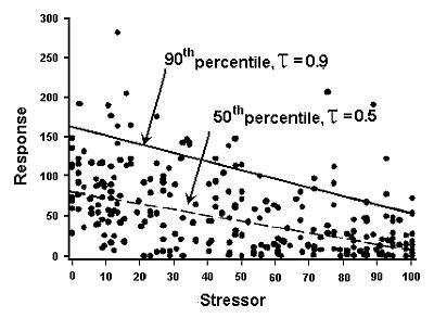 Figure 4. Quantile regression of matched data for a stressor and a response with the 50th and 90th percentiles noted.A quantile regression tool is available in CADStat. Unlike regular linear regression, tools for quantile regression are less readily available, although algorithms like the one available in CADStat are available in R. Among commercial statistical packages, quantile regression is now available in newer versions of SAS/Stat. Blossom, a freestanding (and free) statistical package, also fits quantile regressions and is available from the U.S. Geological Survey.
What do Quantile Regression Results Mean?
How do I Use Quantile Regression in Causal Analysis?
Quantile regression can be used to help describe stressor-response relationships. Quantile regression provides a means of estimating the location of the upper boundary of a scatter plot (e.g., the 90th percentile line in Figure 4). An assumption for using this upper boundary is that the wedge shape often observed in scatter plots of biological metrics results from the effects of other stressors co-occurring with the modeled stressor that cause additional negative effects on the biological response.
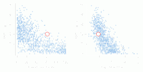 Figure 5. Quantile regressions depicting the 90th quantile for relationships between EPT richness with percent sand/fines (left plot) and log total nitrogen (right plot). Data are from the western United States. The open red circles represent the impaired site.Interpretation of the results of quantile regressions in causal analysis is based on the proximity of observations from the site of the impairment to this upper boundary. These interpretations are qualitative and comparative. In the example shown in Figure 5, data from the impaired site (open red circles) are plotted on scatter plots comparing regional Ephemeroptera, Plecoptera and Trichoptera (EPT) richness with two candidate stressors (increased percent sand/fines and increased total nitrogen). Because the plots show the impaired site closer to the upper boundary of the percent sand/fines relationship compared to the total nitrogen relationship, we might conclude that percent sand/fines exerts a stronger influence on the observed EPT richness at the site in question. This analysis could support the case for percent sand/fines as the cause of the observed impairment and weaken the case for total nitrogen.
Classification and Regression Tree (CART) Analysis
On this Page
- How do I Run a CART Analysis?
- What do CART Results Mean?
- How do I Use CART Analysis in Causal Analysis?
- More information
Classification and regression tree CART analysis recursively partitions observations in matched data set, consisting of a categorical (for classification trees) or continuous (for regression trees) dependent (response) variable and one or more independent (explanatory) variables, into progressively smaller groups (De'ath and Fabricius 2000, Prasad et al. 2006). Each partition is a binary split based on a single independent variable. A typical output from these analyses is shown below (in Figure 6).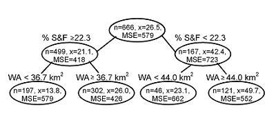 Figure 6. A tree diagram for relative abundance of lithophilous fish (i.e., fish that broadcast spawn on gravel beds) with respect to % sand and fines (% S&F, a measure of fine bedded sediment), and watershed area (WA). Branches are annotated showing the decision rules (e.g., % sand and fines < 22.3). Nodes are annotated showing the mean of the dependent variable (n = number of observations, x = mean value, MSE = mean squared error). Data set provided by the Minnesota Pollution Control Agency.
How do I Run a CART Analysis?
What do CART Results Mean?
CART analysis constructs a set of decision rules that identify homogeneous groups of the response variable as a function of a set of explanatory variables (in Figure 1). During each recursion, splits for each explanatory variable are examined, and the split that maximizes the homogeneity of the two resulting groups with respect to the dependent variable is chosen. To avoid overfitting of the data, algorithms used in CART usually simplify or “prune” the tree that contains all possible splits of the data to an optimal tree that contains a sufficient number of splits to describe the data. For more background and details, see Additional Information on Classification and Regression Trees in the Helpful Links box.
How do I Use CART Analysis in Causal Analysis?
In general, CART analysis can be applied effectively to the causal analysis in three ways. When controlling for natural variability, CART analysis can be used in data exploration to classify systems that differ as a result of natural factors and to develop models that predict environmental conditions as a function of natural factors.
References
- Brenden TO, Wang L, Su Z (2008) Quantitative identification of disturbance thresholds in support of aquatic resource management. Environmental Management 42:821-832.
- Cade BS, Noon BR (2003) A gentle introduction to quantile regression for ecologists. Frontiers in Ecology and the Environment 1:412-420.
- Chaudhuri P, Loh WY (2002) Nonparametric estimation of conditional quantiles using quantile regression trees. Bernoulli 8:561-576.
- De'ath G, Fabricius KE (2000) Classification and regression trees: a powerful yet simple technique for ecological data analysis. Ecology 81(11):3178-3192.
- Kilgour BW, Somers KM, Matthews DE (1998) Using the normal range as a criterion for ecological significance in environmental monitoring and assessment. Ecoscience 5:542-550.
- Loh WY (2002) Regression trees with unbiased variable selection and interaction detection. Statistica Sinica 12:361-386.
- Prasad AM, Iverson LR, Liaw A (2006) Random forests for modeling the distribution of tree abundances. Ecosystems 9:181-199.
- Snedecor GW, Cochran WG (1989) Statistical Methods. Iowa State University Press, Ames IA.
Volume 4: Authors