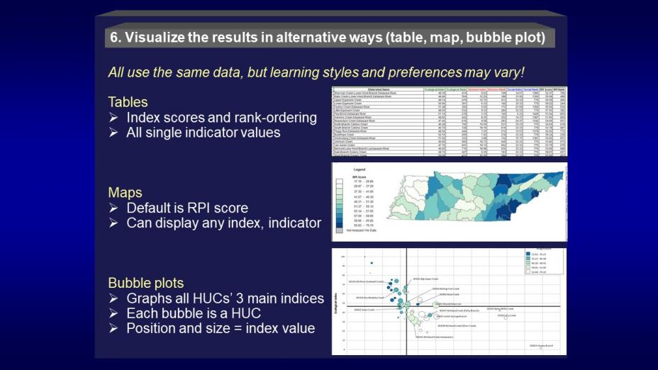
Step 6: Visualize Results as Tables, Maps and Bubble Plots
 You used the techniques in step 5 to begin to compare and detect differences revealed by your screening. You have been gaining a more specific understanding of how certain indicators and indices appear to affect your watersheds, and some of the several comparisons you’ve made may be emerging as more important to the screening purpose than others. The exploratory analysis process has been good for building these insights, and this approach continues in step 6. This step builds on the exploratory analyses of step 5 by focusing in on those observations of possibly higher relevance and further exploring them with the RPS Tool’s visualization alternatives: rank-ordered tables, bubble plots, and maps.
On this page:
Rank-ordering
The RPS Tool delivers rank ordering on its RESULTS tab along with each of the four Index scores described in Step 5. As the simplest of comparison methods, rank-ordering organizes screened watersheds from highest to lowest index scores for each of the four indices. The appeal of rank-ordering is its clarity and simplicity - some watersheds simply score higher than others - which may work well for some users as decision criteria. Rank orders can provide an easy and transparent method to identify a smaller, targeted subset of watersheds, whether by selecting a specific number (e.g., the top 20 watersheds based on RPI score) or a percentage of favorably-ranked watersheds (e.g., the top 5% watersheds from both the Ecological or Social Index results).
The flexibility in rank-ordering is in which scores to use – not only can you choose among the Ecological, Stressor, Social or RPI index results, but watersheds can also be rank-ordered by a single indicator. The limitations of rank-ordering should be noted. Although rank-ordering is useful in distinguishing major differences between high- and low-scoring watersheds, most data likely to be used in a screening probably does not support assuming that very small scoring differences are significant. For example, the 236th-ranked watershed probably is not clearly ‘better’ than the 237th-ranked watershed. Users are advised not to overemphasize the significance of very small rank-order differences. One option for organizing rank-ordered lists in a more generalized ranking is to group them by quantiles, which can be equal-member, equal-value range, or separated by natural breaks in the range of values. More details about using the index and rank-order tables and the RPS Tool’s RESULTS tab are available at RPS Training and User Support.
Bubble plotting
This comparison method was adapted specifically for Recovery Potential Screening as a way to visualize the relative ecological, stressor and social index scores of each watershed at the same time. Bubble plotting visually demonstrates that watershed comparisons are often complex and offers a systematic way to simultaneously observe and consider the relative influence of the three major driving factors on watershed condition and restorability. Two tabs in the RPS Tool control the use of this visualization technique – the BUBBLE PLOT tab and the BUBBLE PLOT OPTIONS tab.
Because a bubble plot displays watersheds plotted relative to X (stressor index) and Y (ecological index) axes, with dot size varying with social index score, differences among watersheds are evident by their position on the graph and relative dot size. A second set of axes -- by default, these are set at the median ecological and stressor index values – splits the bubble plot into four quadrants. These quadrants can provide a way to begin sorting and prioritizing watersheds, depending on your screening purpose. For example, the upper left quadrant contains the watersheds that scored higher than the Ecological and lower than the Stressor median scores; these high-Eco, low-Stressor watersheds often contain the healthiest watersheds (good prospects for protection) along with some impaired watersheds that aren’t under severe pressure from stressors (good prospects for restoration). The upper right quadrant, containing high-Eco and high-Stressor watersheds, offers an alternative starting point; these watersheds may contain good candidates for immediate management action because they are at elevated risk from stressors but do not yet display low ecological scores.
Many options for customizing a bubble plot exist in the RPS Tool, such as assigning a color gradient to the bubbles based on one key indicator of interest, or repositioning the median axes to represent user-selected index value thresholds. More details about using bubble plotting can be found in the training materials at RPS Training and User Support.
Mapping recovery potential screening results
Mapping is a universally familiar and popular method for displaying comparative environmental information. Like the other two techniques, mapping has strengths and weaknesses relative to Recovery Potential Screening. For instance, whereas maps are familiar and understandable ways to communicate results to wide audiences, mapping is best at displaying parameters just one at a time. Although the mapping capabilities programmed into the RPS Tool are limited as compared to GIS, they are easier and quicker to use in low-complexity map displays and still have options for user-modified maps.
Data tables from the RPS Tool can easily be transformed for use in GIS software when necessary. Because many recovery potential indicators come from GIS data and screening is organized around a data table with each record referenced geographically to a specific water or watershed ID, virtually all of the data outputs from screening can be displayed in map form. Many RPS users, however, do not have fluent GIS skills but can still create, customize and save simple maps from their screening data entirely within the RPS Tool.
The RPS Tool’s HUC12 MAP tab default setting displays the watersheds’ RPI score as a light-to-dark color range that corresponds to the high-to-low RPI score gradient. Similar maps can be developed for the ecological, stressor or social index scores, or for viewing any of the 300+ indicators in the Tool’s embedded data table (whether used in the screening or not). This type of mapped product can display screening results for the entire assessment area in a way that allows viewers to recognize individual areas they know, while also revealing geographic patterns such as clusters or corridors of good or bad scores. One perspective added by viewing results in map form is the recognition of watersheds in key locations, which if restored could link together larger corridors or patches of other watersheds in better condition. Such maps can be good at stimulating discussions about possible geographically-based strategies in targeting restoration. More details about using mapping can be found at RPS Training and User Support.
QA/QC your results
Many of the pre-screening QA/QC steps you first addressed in Step 4 are again appropriate at this stage, with modifications to evaluate screening results. Further, it is important to validate the screening results to the extent possible with available information on example HUCs or watersheds that are well-documented and expected to be among either the highest or lowest scores in the screening.
In using reference watersheds to validate results, your evaluation procedures should examine screening results in comparison to reference sites of known quality, including healthy as well as impaired waters or watersheds. One approach involves spot-checking the observed versus expected quantile into which sample watersheds fell during the screening. For example, did healthy reference sites score in the top quartile as expected for a specific RPS index? Another option involves checking the reference watersheds against alternate indicators that are still relevant to condition but were not used in the screening. For each set of indicator values, observe again whether the watersheds performed as expected. Unexpected results should trigger a much closer review of indicator inputs and assumptions throughout the screening process.
Another way of using the ‘reference’ concept is available through the RPS Tool’s BUBBLE PLOT OPTIONS tab for screenings involving a small subset of watersheds from a statewide Tool. By default, the Bubble Plot’s median axes are set at the median Ecological and Stressor Index values of the subset only. But, the medians can be reset to the median scores statewide. When this setting is changed, the distribution of the subset’s bubbles on the plot can change dramatically. Because they are now shown with reference to statewide median scores, it can become evident whether the subset scores far better or far worse than average conditions across the state. This ‘reality check’ against statewide conditions is a valuable part of QA/QC for all screenings and is accomplished in minutes.